
SMART Data Sprint: What is the data journalism debate on social media?
23-27 January 2017, Universidade Nova de Lisboa | NOVA FCSH | iNOVA Media Lab
Project title: The representativeness of Data Journalism on Instagram
Team members: Eduarda Cantaluppi |Elsa Caetano | Felipe Fernandes | Rodrigo Silva
Facilitator: Janna Joceli Omena
»Introduction
»Research Questions
»Methodology
»Data Collection
»Findings
»Conclusion
»References
»Introduction
“The visual is central to everyday life and social media practices, requiring researchers to broaden and diversify the way social media is examined and addressed” (Highfield and Leaver 2016).
General questions
+ What is data journalism debate on social media?
+ Are the hashtags/key actors/concerns transversal to the different platforms?
»Research Questions
+ How data journalism is represented on Instagram?
+ Regarding hashtag usage culture, which hashtags are persistent/predominant over the years?
+ What sort of debate the visual content implies over the years?
+ Can visual content be organized in patterns/clusters over the years? Which ones?
»Methodology
Research strategy
We adopted hashtag exploration to grasp how data journalism debate is represented on Instagram, and the approach of analysis were based on critical analytics and engagement metrics (Rogers, 2016). The selection of hashtags applied in this exploratory study was primarily based on popular hashtags used on Twitter.
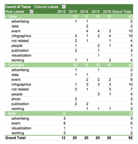
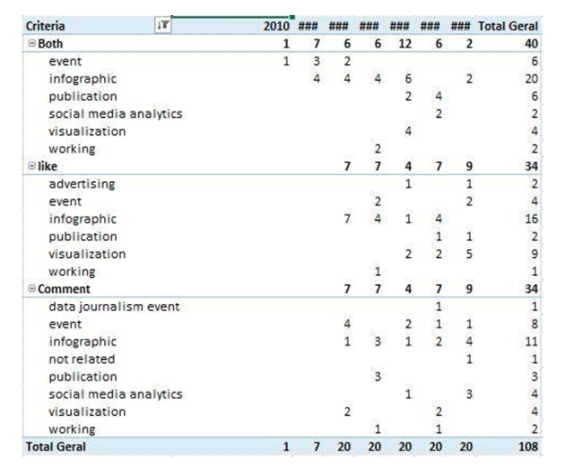
Analysis were based on three types of files, namely: media (with the content of the posts), users (profiles and number of posts of the user with each hashtag) and tagnet (with hashtag network). All the data was organized by year to determine the total and the top 10 of posts, likes and comments in each year from 2010 to 2016. A monthly analysis was done as well. Following the same methodology and topics from the By Year analysis, it was possible to see the evolution of each hashtag.
»Data Collection
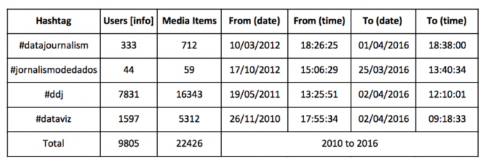
Four hashtags were used to extract data in which three are direct representative of Data Journalism – #datajournalism, #jornalismodedados and #ddj (data-driven journalism), and the other one is closely correlated; #dataviz (data visualization). The sample was collected in March 2016; Instagram Explorer and Instagram Scraper were the extraction software used to get media items and users info.
Approaches of analysis
i) Dominante voice
parameters:
a) users adopting hashtags
create categories of analysis
b) visual content with more likes/comments (top 10 posts with more likes and comments each year)
ii) Concern and iii) Commitment
parameters:
a) visual content analysis generated by dominante voice
[insights per year » list month top 10 (users adopting hashtags + visual content with more likes/comments)
iii) Co-hashtag Network (#datajournalism and #dataviz network generated by Gephi)
»Findings
#ddj: it is associated with many different issues, namely driven-data journalism, “discípulo de Jesus” (disciple of Jesus), music and djs. We tried to exclude the misleading data using associated hashtags (ex: #dataviz and #datajournalism) and the users’ profile. Since in many cases the #ddj was used alone and the profile was blank, we couldn’t filter the data and we have excluded this hashtag from our analysis.
#datajornalismo: it was not consistently used, there is a low count of this hashtag, with no awareness. For this reason, we have not use it in further analysis.
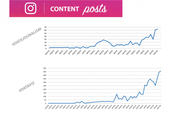
#datajournalism: the hashtag was traced back from 2012 to March 2016. In its evolution, there were some significant peaks between december 2013 and march 2014, and in march 2015 again. The hashtag grew in the network in 2016.
#dataviz: it was traced since 2010. From 2010 until February 2012, its evolution was slow and not significant. After february 2012, some peaks started to appear, showing more clearly the gradual evolution. In the beginning of 2014, the hashtag becomes stronger with high peaks and still growing.
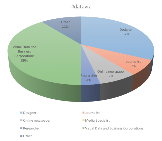
Dominant voice
Using the profile description, we organized the information of the top 30 users of each hashtag in clusters to identify the dominant voice:
Designers: Information designer.infographic experts,
Journalists: journalist, data journalist Online newspapers: newspaper, magazines
Researcher
Design Institutions: design conference, data viz contest,
Visual Data and Business Corporations: Creative Data Studio, MKT Business, Business Intelligence Agency, MKT Agency, Innovations Ag, Visual information Ag, Business Ag,
Media Specialist
Other
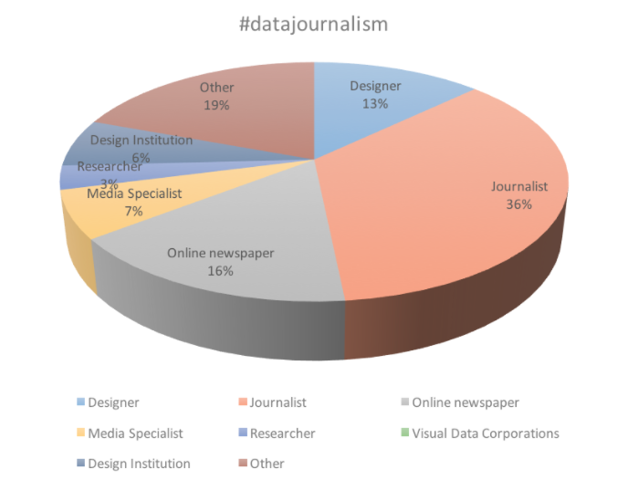
#dataviz is used mainly by Visual Data and Business Corporations (39%) and Designers (32%), meanwhile, #datajournalism is most mentioned by Journalists (36%) and Online Newspapers (16%) (see graphic 2). The occupation of a significant number of users are not specified, which is reflection of the platform usage culture and also a disadvantage in the process of identifying user profile. Due to time constraints, we have not made further research to identify these users, named here as “other”.
Even though designers and journalists use both hashtags, the dominant voice using #datajournalism is represented by journalists, and designers for #dataviz.
Regarding most relevant visual content, we analysed the images and the post description in order to identify themes and create categories. Image classification and analysis relied on top 10 most liked and commented posts of each hashtag; having one top 10 ranking list for each year.
Image Classification:
-
- events: workshops, conferences, etc
-
- working: photos of working places
-
- visualisation: visual and data related
-
- infographics: graphs, infographics, etc
-
- publication: books, magazines, etc
-
- advertising
-
- social media analytic: tip
- not related
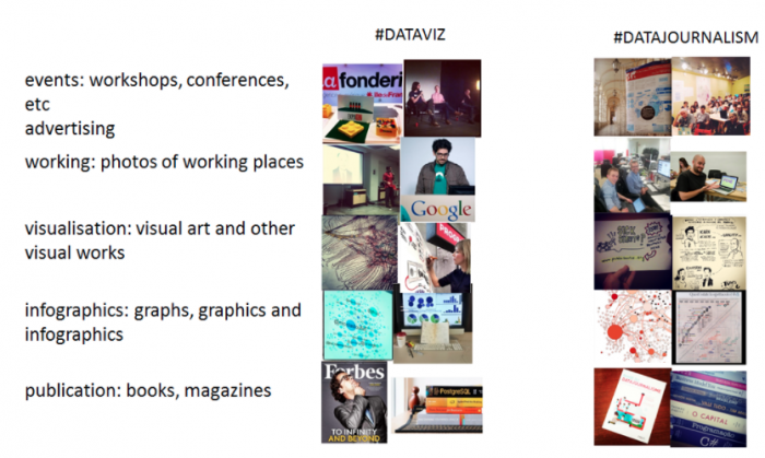
#datajournalism
#dataviz
The top 10 images with more likes and comments with #dataviz is infographics. Even though they are posts on Instagram related to #datajournalism and #dataviz, these tags don’t generate debate but mainly exhibit position of works and advertising.
To understand the possible Alignement and co-relation of hashtags, we used the Tagnet file generated to both hashtags.
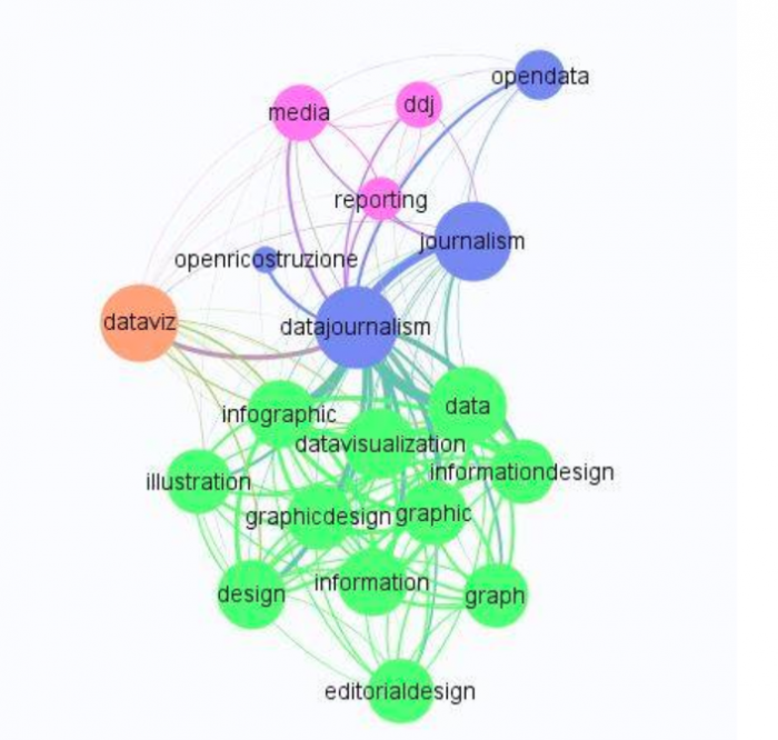
The diagram above shows four clusters represented by tags close associated with #datajournalism, for instance, #dataviz (in orange), #datavisualization (in green) and #media (in pink).
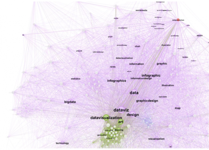
In analysing the network of the #dataviz, we can see a wide range of tags and themes related to this tag (e.g. art, design, big data, infographics). Moreover we notice that #datajournalism is not relevant within the network (the tag is represented by a small orange point on the bottom of the graph). This visualization reinforces the previous analysis and results.
»Conclusion
We found that analysing hashtags because they are “popular” in other social media can be misleading, since on Instagram, #ddj is used to identify many different subjects that are not “data driven journalism”.
Because of the specific characteristics of Instagram e.g. (usage culture), we realised that the way Data Journalism is represented is different from other social media.
People with more likes and comments use this Social Media to:
- Show projects (infographics) or Visualizations
- Show themselves in Events (Conferences, workshops, courses) or to advertise them
- Advertise publications and products (infographics)
- There is no debate on #datajournalism on Instagram, since there is no discussion about the subjects
The key players using #datajournalism hashtag are journalists, but #dataviz is (again) a misleading hashtag when used alone, since is mainly used by designers to pinpoint events and infographics not related to #datajournalism. We conclude that #dataviz is used in association with #datajournalism for more accurate results on this matter; #dataviz have no relation whatsoever with #datajournalism.
»References
Rogers, Richard (2016). Otherwise Engaged: Critical Analytics and the Meanings of Engagement. Available at: https://www.youtube.com/watch?v=sNwl-qGrK7M&list=PLKzQwIKtJvv_cfzQWIaVCb1H60xaeDjkL
Rogers, Richard (2016). Otherwise Engaged: Critical Analytics and the Meanings of Engagement – slides. Winter School 2016 (11 January). Available at: https://t.co/Wt13I4PBAu