
Interrogating Vision APIs
Digital Media Winter Institute 2019
SMART Data Sprint: Beyond Visible Engagement
28 January – 1 February 2019
Universidade Nova de Lisboa | NOVA FCSH | iNOVA Media Lab
Project title: Interrogating Vision APIs
Project leaders: André Mintz and Tarcizio Silva
Team members (alphabetical order): Beatrice Gobbo | Elena Pilipets | Hamdan Azhar | Helen Takamitsu | Janna Joceli Omena | Taís Oliveira
Project pitch slides: link
Final presentation slides: link
Key Findings
Introduction
Research Questions
Research Design
Methodology
Visual Network Analysis
Findings
Discussion
References
Key Findings
-
The three approached computer vision APIs – provided by Google, IBM, and Microsoft – present very different labelling characteristics which describe different ontologies and semantic spaces. Concerning levels of detail, Google’s API tends to higher levels of specificity; IBM’s is somewhat specific but not as much as Google; Microsoft’s is usually very generic and has a limited labelling scope.
-
Stock image sites represent national visualities with recurrent themes for which computer vision APIs are useful as descriptive aids, foreshadowing emergent typical figurations.
-
Computer vision APIs present varying levels of sensibility and modes of treatment of culture specific pictures. While Google’s service recognizes several specific items related to food or musical instruments its accuracy is not always satisfactory. Microsoft’s API showed Americanizing/Westernizing cultural bias in some of the approached cases. Generally, all APIs seem to have algorithmic architectures favoring the performance of cultural neutrality with generic categories scoring higher than specific terms.
-
The approached computer vision APIs reproduced lack of attention to specific culture markers, especially linked to minoritized groups, a possible reinforcement of hierarchized ethnic-racial relations.
Project overview
This project proposes to investigate Vision APIs as research devices while experimentally applying them for the study of visual representation of countries through image results of demonyms (brazilian, portuguese, american etc). This double-ended approach is based on STS’s principle of symmetry, which takes an inquiry as concerning both the object of study and the methodology used in its description and analysis (Marres & Moats, 2015). To that end, the study is based on the approach of large visual datasets collected from different stock photos websites (Shutterstock and Adobe Photo), attempting to derive descriptions and to identify patterns of comparisons, also, developing considerations on the prospects and limits of the applied methodology.
Regarding computer vision APIs
Visual computing is one of the most thriving fields of computing and AI, being deployed in numerous industries, like manufacturing, biometrics, augmented reality and others (Porikli et al., 2018).. Specifically, computer vision is defined as the collection, analysis and synthesis of visual data through the using of computing, with several objectives such as recognition of faces and semantic content like objects, entities and contexts in images (Wang, Zhang & Martin, 2015). Despite significant advancements in these services discipline, however, computer vision deals, from the start, with an ‘ill-posed’ problem, which means that no optimal solution can be found to such tasks, but only approximations, with their limits defined both by technical challenges (Smeulders Et Al., 2000) and cultural and discriminatory biases.
Images have become increasingly central in online communication, without accompanying proportional efforts in devising methodologies for their approach. Studying images in social media is notably difficult due to challenges posed to computationally interpreting visual data. Thinking about social media visual data as “qualitative data in quantitative scale” (D’orazio, 2013) brings new challenges related to the size of datasets and amount of work required for coding and tagging visual materials.
In some sense, a lot of this work can be circumvented with the use of automatic tagging of semantic content, now available to researchers through computer vision libraries or APIs. Most of the main technology/digital media providers launched their own computing and artificial intelligence platforms. IBM Watson, Amazon Web Services, Microsoft Azure and Google Cloud Platform are some of them.
Regarding the use of visual computing tools for analysing behavior and cultural trends, some examples are semantic geo mapping of cities (Rykov et al., 2016; Ricci et al., 2017); comparative studies of selfie cultures (Tifentale & Manovich, 2015); visual persuasion analysis (Joo et al., 2014; Hussain et al, 2017); “home styles” of Republican and Democrats (Anastasopoulos et al, 2016); classifying of electoral advertisements (QI et al, 2016); imagery of brazilian demonstrations (Omena, Rabello & Mintz, 2017) and others projects.
Discovering bias, prejudices and significant differences between systems of AI and machine learning are goals of researchers preoccupied with gender (Hendricks et al, 2018), race (Buolamwini, 2017) implications of the wide and availability. Some of them are resulting in actionable information like best practices guides (Osoba & Welser IV, 2017) or proposal of carefully designed datasets for machine teaching (Buolamwini & Gebru, 2018).
So, undertaking some of the premises and principles of the ‘digital methods approach’ proposed by Richard Rogers (2013), in this study the biases inherent to such tools and methods are going to be dealt with in practice. This means that the tools are not going to be entirely discarded based on those issues, but neither will them be taken for face value. In acknowledging their limitations and distortions as aspects of the mediatory condition of such APIs (Bucher, 2013), we will take a concrete case study as the grounds on which to build a critical approach to them.
Regarding the case study
Established stock photos companies exist since the 1920s (Bruhn, 2006), providing photographies to editorial companies, advertising agencies and industries, being deployed to a wide range of media formats such as magazines, newspapers, out-of-home media and packages. However, cultural analysis on their representational roles are relatively recent. Frosh (2001) elaborates on that point writing about images’ different meanings and references layers for its producers, buyers and final media consumers. A crucial concept is invisibility: most media consumers never hear about stock photos, but only consume and interpret them in their final contexts.
With the wide spread of media production technologies through social media platforms, media fragmentation is present not only in the audiences’ field (Napoli, 2008) but also in media production, where the barriers for new players are minimal. Marketing departments, advertising and PR agencies need to publish continuously in platforms as Facebook and Twitter. In this context, stock photo websites and image repositories receive increased attention, visibility and monetization, driving the visual culture for professionals around the world. But there are also significant asymmetries (geopolitical, of genre, class, race) between the buyers of images and their providers such as search engines (Google, Big, Yahoo) and professional stock photos companies (Gettyimages, Depositphotos, Shutterstock, Fotolia and others).
The aforementioned invisibility presents itself partially also in the academic field. Scientific papers on critical observation and analysis of image repositories are scarce, especially when we are talking about digital methods and social computing. Among the most recent investigations about production and circulation of stock photos, we can cite the work of Pritchard and Whiting (2015) on gendered aging; data sprints on gender representations (Aiello et al, 2016) and visual genericity on five newspapers (Aiello et al, 2017); gender stereotyping (West, 2018); and a method proposal to increase fairness in image recommendation systems (Karako & Mangalla, 2018). Our proposal, then, is also to contribute to the pool of experiments on stock image photos using digital methods lens and interrogation vision APIs as well.
-
What are the differences between computer vision API providers?
-
How do computer vision APIs “understand” the same photos?
-
How do the label ontologies of each API compare to each other?
-
-
Can we investigate national representations using computer vision tools?
The research relies on a mixed methods approach which starts from the queries made to the stock image sites, passes through the processing of the obtained images by different computer vision APIs and, finally, arrives on the analysis of the data thus produced through a variety of approaches which aims at different aspects of the posed questions.
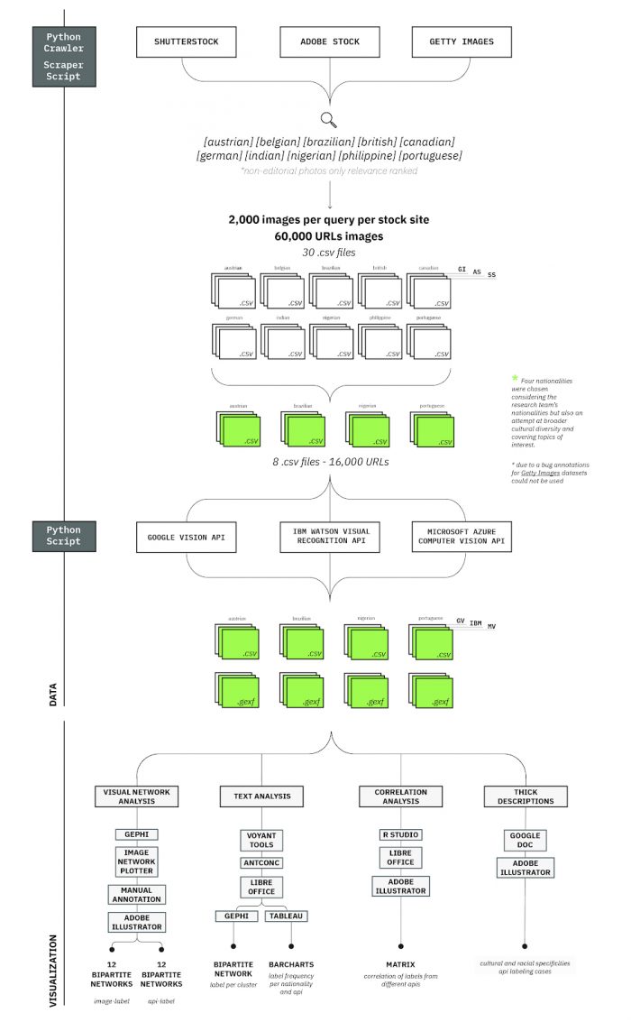
Figure 1 – Diagram illustrating the research design protocol.
The research protocol affords some diversity which would allow comparative approaches for each of the three main axes of the inquiry: vision APIs, stock image sites, and nationalities. Apart from the vision APIs themselves, for which the comparative approach is the main focus of the study, multiple nationalities are important given our interest in the treatment of cultural specificities by the APIs – for which a diverse dataset would be important. Multiple stock image sites are interesting for diversifying the representation biases of each nationality across different sources, but this aspect is not so central to our analysis in the scope of this study.
This could be understood as a triangle of variables, for which we identify two main lines of inquiry, described in the higher hierarchy of the research questions expressed in the previous section. In branch A, the focus is a comparative approach across the different APIs, thus the nationalities and stock image sites remain invariant while the vision APIs are compared. In branch B, the focus is how nationalities are treated by vision APIs and, thus, stock image sites and vision APIs remain invariant while nationalities are compared. In this case, we have opted to use data from Google Vision API as the standard for comparison. In the scope of this study we have chosen not to compare stock image sites, not discriminating among them in the analysis.
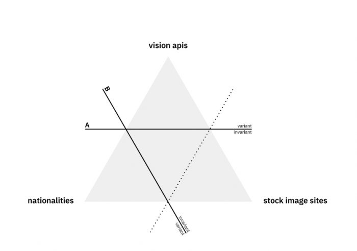
Figure 2 – Diagram of the three comparable aspects of the research and indication of the chosen lines of inquiry.
These two main approaches are described here illustratively, but they are not entirely distinguished in our approach, as we have often mixed aspects of both in the analytical procedures. This will become clearer in the description of the methodology and findings. These two focuses will be more important in the discussion of the findings, in attempting to answer the research questions posed from the outset.
Methodology
Data collection
Before the data sprint, data for 10 different nationalities was initially collected, considering the nationalities of participants that were enrolled for the event. We selected three stock image sites for the data collection, considering their popularity: Shutterstock, Adobe Stock and Getty Images. For each of them, we established a common querying protocol which, besides the query term, included a selection of certain filters, when available: only photos, non-editorial content and ranked by relevance. These properties aimed to avoid journalistic content (which would be specific to recent events, instead of typical visual depictions); to avoid illustrations and other artistic depictions; and to attempt at a typicality ranking, considering what each stock site would consider more ‘relevant’. We established a desired sample size of n=2,000 images for each stock site per nationality in a loose consideration of the significance and manageability of the datasets.
For the scope of the data sprint, four countries were chosen to be analyzed. Criteria involved building a representative group with regards to cultural peculiarities and global diversity, while also attempting to prioritise the nationalities of the team, considering the group’s ability to interpret the data. The four chosen countries were: Austria, Brazil, Nigeria, and Portugal.
Tools
-
In order to automate the querying and downloading of the pictures, we devised a custom crawling and scraping script in Python (available here).
Vision API submissions
We chose 3 providers of computer vision services as focuses of our analysis: Google Cloud Vision API, Microsoft Azure Computer Vision API and IBM Watson Visual Recognition API. Each of these APIs provides several analytical modules for processing images (see Table 1). Within the scope of this study, the images were processed through their respective modules which provide descriptive tags or labels – Label Detection, for Google; Image Classification for IBM; and Tags for Microsoft.
The images were batch submitted using a custom Python script developed by the research institute IBPAD (by Nilson Guerin Jr. and Tarcizio Silva), based on Memespector script. Memespector was originally developed in PHP by Bernhard Rieder and later ported to Python and expanded by André Mintz.
The custom Python script uses an image list (consisting of URLs and other tabular data in csv format) as its input, then downloads and processes the images through the APIs, returning the annotated tabular (csv) and relational (.gexf) data.
Table 1 – Main Resources: Computer Vision API Providers
|
|
IBM |
Microsoft |
|
|
Labels / Tags / Classes* |
Yes |
Yes |
Yes |
|
Web Entities |
Yes |
No |
No |
|
Categories |
No |
No |
Yes |
|
Food Classes |
No |
Yes |
No |
|
Phrasal Description / Auto Generated Captions |
No |
No |
Yes |
|
Explicit Content Flagging** |
Yes |
Yes |
Yes |
|
Face Count |
Yes |
No |
Yes |
|
Facial Expressions*** |
Yes |
No |
No |
|
Under Exposed |
Yes |
No |
No |
|
Blurred |
Yes |
No |
No |
|
Headwear |
Yes |
No |
No |
|
Celebrities |
No |
No |
Yes |
|
Landmarks |
Yes |
No |
Yes |
|
Gender Identification |
No |
Yes |
Yes |
|
Age |
No |
Yes |
Yes |
|
Text Recognition |
Yes |
No |
No |
|
Text Language |
Yes |
No |
No |
|
Web Full Matching Images |
Yes |
No |
No |
|
Web Partial Matching Images |
Yes |
No |
No |
|
Web Visually Similar Images |
Yes |
No |
No |
* Each API names this differently, but we are referring to modules that recognize objects, entities, actions and/or context within the images’ visual content.
** Explicit content categories for each API. Google: Adult, Spoof, Racy, Medical, and Violence. IBM: Explicit. Microsoft: Adult and Racy.
*** Facial expressions detected by Google: Joy, Sorrow, Anger, and Surprise.
Tools
-
Google Cloud Vision API
-
IBM Watson Visual Recognition API
-
Microsoft Azure Computer Vision API
-
Custom Python script based on Memespector script
Visual network analysis
In order to analyze both the labeling performed by each API and the visual characteristics of the approached datasets, the study resorted to bipartite network visualizations by processing label attribution to images as relational data. An affordance of Memespector script and which has become a common approach to similar research (Ricci et al., 2017; Omena, Rabelo & Mintz, 2017; Silva, Apolonio & Meirelles, 2018; Geboers et al., 2019) image-label networks are generated taking images and the descriptive labels provided by the vision APIs as two types of nodes. The edges then represent the attribution of a label to an image.
This representation of the data enables its processing and visualization using network analysis tools such as Gephi, which provides several analytical tools from layout algorithms to statistical tools related to social network analysis and graph theory’s methodological framework (Wieringa et al, 2019). For this study, the analysis relied mostly on visual network analysis (Venturini et al 2015; Venturini et al 2018; Rosa, Omena and Cardoso, 2018), which focuses on describing features of the dataset according to topological traits of the networks based on node position, size and color coding. ForceAtlas2 (Jacomy et al. 2014) was the main layout algorithm used and Modularity calculation (Blondel et al, 2008) was used as an aid for identifying the main clusters. Network modularity divides the network in sections according to their possible community structure, attributing codes to each partition. Depending on the represented data, those partitions could lead the researcher to discover meaningful groups, such as thematic, geographical or general semantic concepts.
The network visualizations were printed out in larger paper formats for identification of cluster as a complement for the visualization on screen.
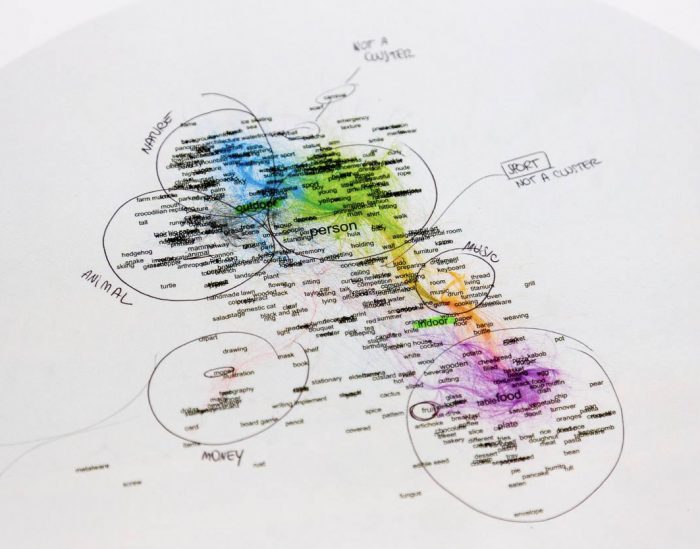
Figure 3 – Documentation photo of the visual network analysis process.
This approach had a central role in understanding the differences in each API semantic space as well as for describing the visual datasets in aggregate form, as a collection of emerging visual patterns clustered by similarity. The identified clusters were put in relation to common comparative categories that were established across the approached datasets, and this step was also important for defining the labels pertaining to each category – information that was used in text analysis and correlation analysis methods.
Apart from the network visualizations themselves, approached comparatively, the study also relied on network plots in which the image nodes were represented by images themselves – thus allowing scrutiny of their own visuality, instead of relying solely on the descriptive labels provided by the APIs.
Tools
-
Gephi – network visualization software
-
Image network plotter script – for plotting the images onto the spatialized bipartite networks
-
Inkscape – for navigating the networks with plotted images and accessing their respective links
-
Adobe Illustrator – for creating the network-matrix and highlighting clusters
Text analysis
Most of the available text analysis tools were developed by corpus linguistics and computational linguistics researchers to study natural language texts. Some of the common resources of those tools analyses the distribution of words in a corpus or set of corpora. We repurposed corpus linguistics tools to analyse lists of labels/tags in our annotated spreadsheets. The frequency of labels/tags in each dataset were used during analysis as a tool to compare the main themes in each country dataset, between the API providers and inside each cluster.
Labels/Tags variety and frequency
Focusing on the annotated spreadsheets labels and tags, we applied text analysis tools and concordancers to count the total amount of different labels/tags and their frequency in the datasets.
Tools
-
Online text analysis software: Voyant Tools
-
Desktop text concordancer: AntConc
-
List comparison: DMI Triangulate Tool
-
Visualizations: Tableau
Cluster dictionaries
Often in the study there was the need of topical segmentation of the list of labels that would allow filtering the data according to particular categories – e.g. ‘food’, ‘people’, ‘nature’. This segmentation was necessary, for instance, for generating topical network visualizations or for analyzing the correlation of labels within particular themes.
In order to do this, visual network analyses were used as starting points. The categorization of the labels was done by mapping the identified topical categories through the modularity classes (Blondel et al., 2008) attributed by Gephi’s inbuilt analytical tools. The nodes table was exported containing both the labels and their respective modularity class which as then attributed to a topical category.
Far from flawless, this method provided a heuristic approach rather than a definitive dictionary, because manual coding was not an option due to time constraints. This is because many labels falling in the transition between different topical clusters came to be included in a wrong cluster. This then created some noise which had to be compensated by critical approach to the data.
Thick descriptions
In order to pursue a deeper qualitative understanding of the APIs’ sensitivity to cultural specific imagery, the analysis also included thick descriptions approaches which aimed at the examination of small groups of images or individual images and how the APIs would label them. While the analysis would ultimately come down to the assessment of labels applied to the images in light of contextual knowledge of the countries and cultures being represented, this approach still had the challenge of narrowing down from the large visual datasets at hand to these specific and often quantitatively small cases. Filtering instances of specific annotated labels allowed to analyse small sets of images linked by related labels. For so doing, the study relied on mixed exploratory strategies.
The bipartite image-label networks generated in a separate methodological path (see above) was one of such exploratory devices which allowed for examining the visual patterns emergent within the datasets as well as possible miscategorizations or exceptions to them.
Google Sheets was also an important tool given its ability to show thumbnail previews of image urls through its inbuilt ‘IMAGE()’ function. It made it possible to filter the datasets according to particular labels of interest and then scrutinize the images to which they were applied by the API. This redirection of the analysis could be approximate to reverse engineering of the APIs, given that taking the labels as the starting point it is possible to infer aspects of the training data fed into the algorithms and their possible biases.
Tools
-
Google Sheets – for tag filtering and image preview
-
Inkscape – for exploring image network visualizations
Correlation analysis
As an additional approach for understanding the semantic spaces of the APIs and to compare them, the study proceeded to use correlation analysis to understand which labels were frequently attributed to the same images, as well as labels that rarely tended to co-occur. This approach could potentially be used to identify nearly equivalent labels, both within the same API, as well as across different APIs.
In order to compute label correlations, custom R scripts were developed that first transformed the raw label data from each of the three APIs – initially consisting of comma separated strings of labels corresponding to each image – into binary matrices of 1s and 0s, with rows representing images and columns representing labels. With matrices in hand for each API, different APIs can easily be compared by merging their respective matrices and joining on each image’s unique identifier. (For example, to compare labels between Google Vision and IBM Watson, we can use a merged matrix where each row is an image, and the first 5,521 columns each correspond to a Google Vision label, and the last 5,548 columns each correspond to an IBM Watson label.)
Thus, we can generate a correlation matrix that computes Pearson’s correlation coefficient (r) for each pair of Google Vision – IBM Watson labels, and also tests each association for statistical significance.
Constraints to the full completion of this task were the volume of labels and of their occurrences, as well as the heavy calculations it entailed. Also, the visualization of those correlations would require not only filtering but also the smart ordering of the labels to make it more easily browseable. We thus chose to use the cluster dictionaries that were produced in a combination of visual network and text analyses as a parameter to segment the correlation analysis.
Tools
-
R Studio – for processing the calculations
-
LibreOffice Calc – for exploring the data generated
-
Adobe Illustrator – for designing the final heat map
Contrasting APIs’ semantic spaces
By semantic spaces, we refer to the topology that is formed by the relationships among labels attributed to the images by Vision APIs. With variable modes of attribution, these labels respond to black-box machine learning techniques of Google, IBM and Microsoft Vision APIs. We hypothesized that the relational semantic space that is formed by label co-occurrences can be compared. After observing differences and considering the level of detail afforded by each vision API, we came to describe them by three illustrative personas. Microsoft’s API would then be a ‘rookie’, given its rather generic and unspecialized labelling. IBM’s would be an ‘amateur’, with its intermediate level of specificity. Google’s API would then be the ‘expert’, with a much higher level of specificity and granularity of its categorization. Evidently, this overall perspective can vary with regards to particular cases or topics.
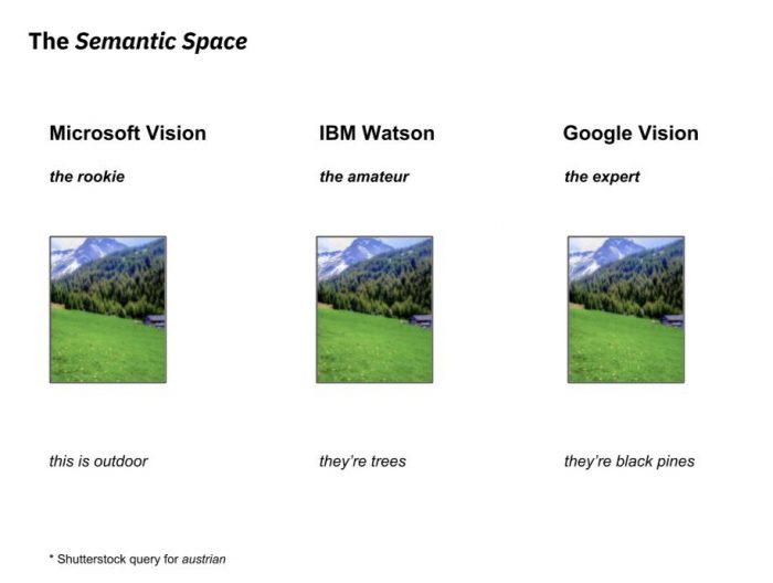
Figure 4 – Labeling personas illustritatively describing each API.
Different approaches were thus devised for understanding and comparing the semantic spaces of each API – namely: the number of labels, the shape of the network and the sharing of labels among APIs mainly advanced by visual network analysis, and correlation analysis – in order to understand possibly equivalent labels across APIs.
An initial finding on that regard relates to the overall level of granularity of the labelling of each vision API, which can be inferred from the absolute number of labels attributed by them to each studied dataset. Table 2 summarizes those numbers. As can be easily perceived, Google and IBM’s APIs attributed about four times more labels than Microsoft’s API. This indication alone suggests the more generic and less detailed labeling of the latter.
Table 2 – Number of unique labels attributed by each vision API to each of the studied datasets (n=4,000).
|
Austrian |
Brazilian |
Nigerian |
Portuguese |
|
|
Microsoft Azure Computer Vision API |
317 |
561 |
485 |
501 |
|
IBM Watson Visual Recognition API |
1,632 |
2,044 |
1,846 |
1,991 |
|
Google Cloud Vision API |
2,037 |
2,170 |
1,145 |
1,992 |
Furthering that observation, the method of visual network analysis, aided by the spatialization of ForceAtlas 2, proved to be a productive approach given its highlighting of topological features of relational data. This force-directed layout works under the logic of power-law distribution and preferential attachment (Jacomy et al. 2014), providing thus a very particular logic for reading Vision APIs semantic space. Importantly, these bipartite networks are formed by a confluence of the labeling and the configuration of the approached visual datasets. Thus, the way labels and images are distributed along the network’s center and periphery seems to be a result of at least three factors: a) the generality or specificity of the labels; b) the variety of objects/entities defined by the scope of the dataset and its topic-specificity; c) the topological features of semantic space resulting of the labeling by each provider.
That is something we concluded after analysing a total of 12 image-labels networks (for each Vision API, four networks corresponding to the different nationalities). For instance, we see in figure 5 very particular clusters positioning in the periphery of the network as a result of Google Vision API’s labelling: dogs breed, food and musical instruments. These clusters’ formation are a result both of the dataset’s prioritization of the topic and of Google Vision API’s high level of granularity in describing it, with very specific labels such as ‘spanish water dog’, ‘lagotto romagnolo’ and ‘cão da serra de aires’ in the Dogs Breed cluster.
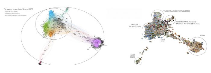
Figure 5 – Reading Vision APIs semantic space through the technique of visual network exploration and the spatialization afforded by ForceAtlas 2.
In an effort to compare the topology of each API’s semantic spaces, Figure 6 exhibits a matrix of bipartite image-label network visualizations for each nationality dataset (columns) and for each vision API (rows). Within each nationality dataset, we first merged the bipartite image-label networks built of data from each vision API. In the resulting combined graph each image would be connected to labels generated by all three vision APIs (Google, Microsoft and IBM’s). This joint graph was then spatialized through ForceAtlas2 layout algorithm and later filtered for each of the APIs’ labels and the network visualizations brought to the grid exhibit only the edges of those graphs.
By applying the spatialization algorithm to the combined graph, we were able to cast the semantic spaces of the different vision APIs onto a shared plane. This makes them more easily comparable, given that within each nationality dataset the graphs exhibit a similar silhouette and differ mainly with regards to how their edges describe spaces of varying densities and fragmentation.
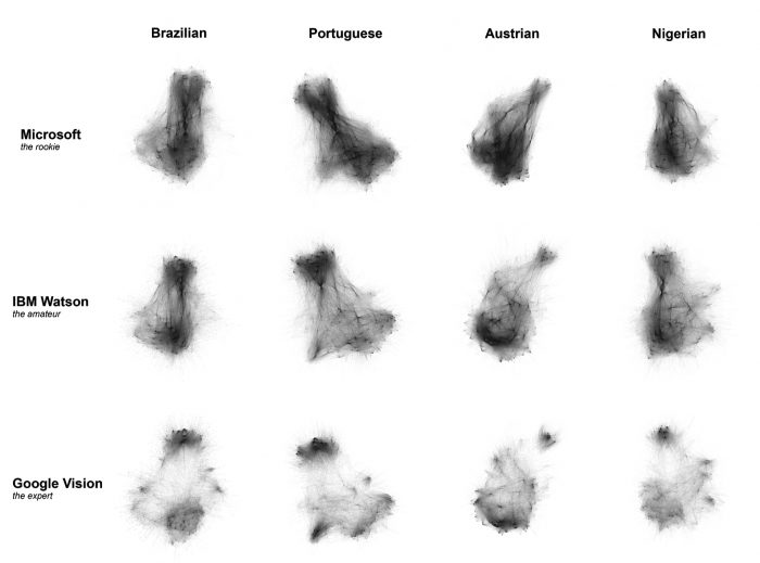
Figure 6 – Comparative matrix for semantic space topology of each vision API.
This perspective significantly advances the quantitative approach summarized in Table 2, given that even though the APIs provided by IBM and Google attribute a similar amount of labels to the datasets, their semantic spaces are quite distinct. From these visualizations it is then possible to describe some of the traits of each vision API semantic space and thus characterize their labeling performance.
Microsoft Azure Computer Vision API: exhibits a highly connected and nearly homogeneous graph. Clusters are less defined and highly interconnected, which, in comparison with Google Vision and IBM Watson, suggests a lower level of detail in its labeling. With higher density in its center, the graph also indicates the strong influence of generic labels connected throughout the semantic space. Among these generic labels, we have found the strong influence of labels such as ‘indoor’ and ‘outdoor’. Also, action-related labels (‘standing’, ‘cutting’) were found to be particular to this API.
IBM Watson Visual Recognition API: falls somewhere in between Microsoft and Google’s APIs, in terms of homogeneity and fragmentation. A few clusters are clearly defined in the periphery, but there is still a strong connectivity of bridge nodes which bring some density to the center of the graph. This then suggests that the API is able to be detailed within some semantic zones, but that it still exhibits some influence of generic labels. Color labels were found among these generic types, often in highly specific color shades such as: ‘reddish orange color’, ‘ultramarine color’ or ‘greenishness color’. This color orientation and level of detail was found to be particular to this API.
Google Cloud Vision API: most fragmented of the three semantic spaces, the graph has many clearly defined clusters which exhibit somewhat cliquish connectivity, with high individual density but little interconnectivity among them. This seems to indicate a higher level of detail and specialization of the API’s labelling. In fact, this finding is coherent with the findings from the thick description approach, which indicate the high granularity of the labels, including the cultural specific description of objects and other topics.
Another approach seeking to investigate the semantic spaces of the APIs regarded the testing of the sharing of labels among the APIs, particularly with regards to labels pertaining to the common clusters identified across the APIs and datasets (see the Cluster dictionaries subsection within ‘Methodology’). For this approach, we did not discriminate the different nationality datasets and solely investigated which labels were shared among two or three of the APIs and which of them were specific to only one of them. Further work needs to be done, however, for in-depth analysis of the sharing labels among the APIs.
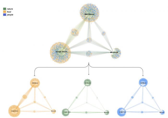
Figure 7 –Bipartite network visualization of the relationships between labels and APIs. Nodes represent either labels or the APIs they pertain to. Edges are drawn when the label has been attributed by that API at least once in the study.
Figure 7 exhibits triangular graphs that were built from the relationships among labels and APIs. For these visualizations, and due to common types of clusters detected among the APIs, we only included labels found to be pertaining to the clusters related to ‘nature’, ‘food’ and ‘people’. Nodes stand for each of the three APIs and also for the labels attributed by them. An edge is drawn between them when at least once in our datasets a label is attributed by an API. The triangular shape of the network serves as a strategic approach for reading the shared labels among Google, Microsoft and IBM. By making the APIs nodes static on the vertices of a triangle, we were not only able to see the labels shared between two APIs (GV-MV; MV-IW; IW-GV) but the labels shared among the three APIs.
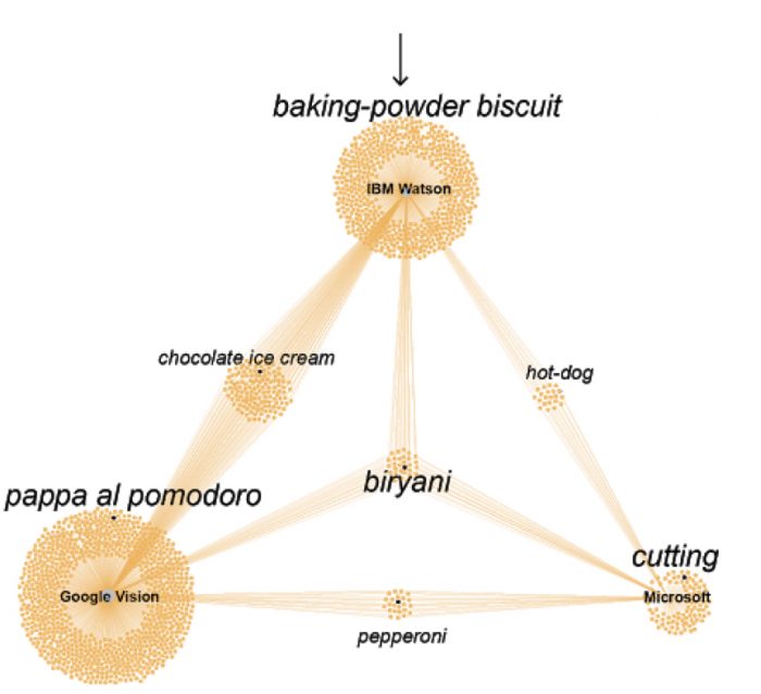
Figure 8 – Detail of the previous figure regarding labels pertaining to the ‘food’ category.
As we previously pointed out regarding the number of labels attached to each Vision API, Google has the largest amount of those, followed closely by IBM and with Microsoft lagging farther behind. What is relevant here is the small number of labels shared by all three APIs which indicates large differences in their ontologies and labelling performances. Google and IBM seem to share more labels between themselves than with Microsoft, which is expected given that their larger absolute count of labels makes it more likely.
From the segregation of labels according to their topical clustering, it can also be perceived that the ‘food’ topic is the one in which all three APIs bare the largest number of labels and, also, in which they share the more labels amongst themselves. While this can be an outcome of the amount of food-related images found in the datasets (as will be indicated in the next subsection), this also seems related to a general level of detail for the labelling of this topic across all three APIs. The higher detailing of food imagery among the APIs seems an indicator of the prioritization of the topic as part of their commercial orientation and foreseen uses.
Still on the comparison among semantic spaces, we used correlation analysis in order to understand possibly equivalent labels across APIs. The idea, initially, was to devise a translation table for moving across the different semantic spaces. Of course, this can only be asserted in terms of probability and what we then pursued was finding correlation indices for the labels of each API as indicators of the likelihood that two labels would occur on the same image. Given the exponential growth of this computational task, we chose in this study to process exclusively the food cluster and only for Google Cloud Vision API and IBM Watson Visual Recognition API.
Figure 9 is the heatmap generated from this processing, considering only the most correlated labels (positively or negatively). For the sake of data reduction, we applied a two-stage filtering protocol on the initial 1145×783 space of Google and Watson food cluster labels. First, we applied a frequency threshold to restrict the analysis to labels that appeared in at least 0.05% of all images, for each API. While seemingly a small threshold, this reduced our label space to 276×262, highlighting the long tail of sparsely used labels in our dataset. Then, we computed correlations for each of the 72,312 label pairs and isolated the 100 pairs with the highest absolute correlation coefficients (where the raw correlation coefficients ranged from r=+0.33 to r=+0.78). We then subset the 276×262 label space to only include labels which were present in the top 100 pairs, yielding our final reduced heat map of 64 Google API labels x 50 Watson API labels.
From this visualization, we were able to identify different categorization practices among the APIs, as well as labelling mistakes which relate to the broader question of cultural specificity. IBM Watson has two labels which show interesting correlation patterns when compared to Google: ‘delicacy’ and ‘dish’. They have somewhat strong correlation factors across the whole column, and they tend to be opposite of each other – i.e. when one of them is strongly positively correlated, the other is strongly negatively correlated. Usually, the difference is between labels related to sweet foods: ‘delicacy’ is often positively correlated to those, whereas ‘dish’ is negatively correlated. IBM’s ‘delicacy’ is positively correlated to Google’s ‘chocolate’, ‘confectionery’, and ‘praline’, for instance, and negatively correlated to a myriad of savoury foods, such as ‘falafel’, ‘french fries’, ‘soup’, or ‘meat’. Meanwhile, IBM’s ‘dish’ is inversely correlated to all of those, and to the same degree. This is curious given that, according to its dictionary definition, a delicacy is not necessarily sweet, but rather a rare or expensive food. Seemingly, however, the training data fed into IBM’s algorithm does this distinction while also favouring the connection of ‘dish’ to savoury foods. Also curious is that Google attributes a ‘dish’ label as well, but that it is not too strongly correlated to IBM’s ‘dish’, which indicates different visualities for these labels for each API.
A few interesting examples of cultural specific labels. Google attributes a label for ‘wok’, a culture specific kitchenware, which only correlates, positively and strongly, with IBM’s ‘cooking pan’ which would be a more culturally neutral or cross-cultural term, applicable to many different types of equipment. This implied less nuanced categorization by IBM is surprising if it is considered that their API is the only among the three that were observed which advertises providing a more nuanced resource on food classes. Some correlations of two distinct cultural specific terms, were also observed, such as between Google’s ‘cheese bun’ (attributed to a Brazilian treat) and IBM’s ‘gefilte fish’ (a Jewish delicacy), or between Google’s ‘yakitori’ (a Japanese dish) and IBM’s ‘kabob’ (an Arab dish). All of these seem reasonable ‘mistakes’ given the visual similarity of those items. Yet, in broader consideration in a deepening of this study, cases like these could be indicators of cultural biases of each API or, alternatively, of different treatments of cultural specificity – such as in efforts at something like a cultural neutrality (as in the ‘cooking pan’ case).
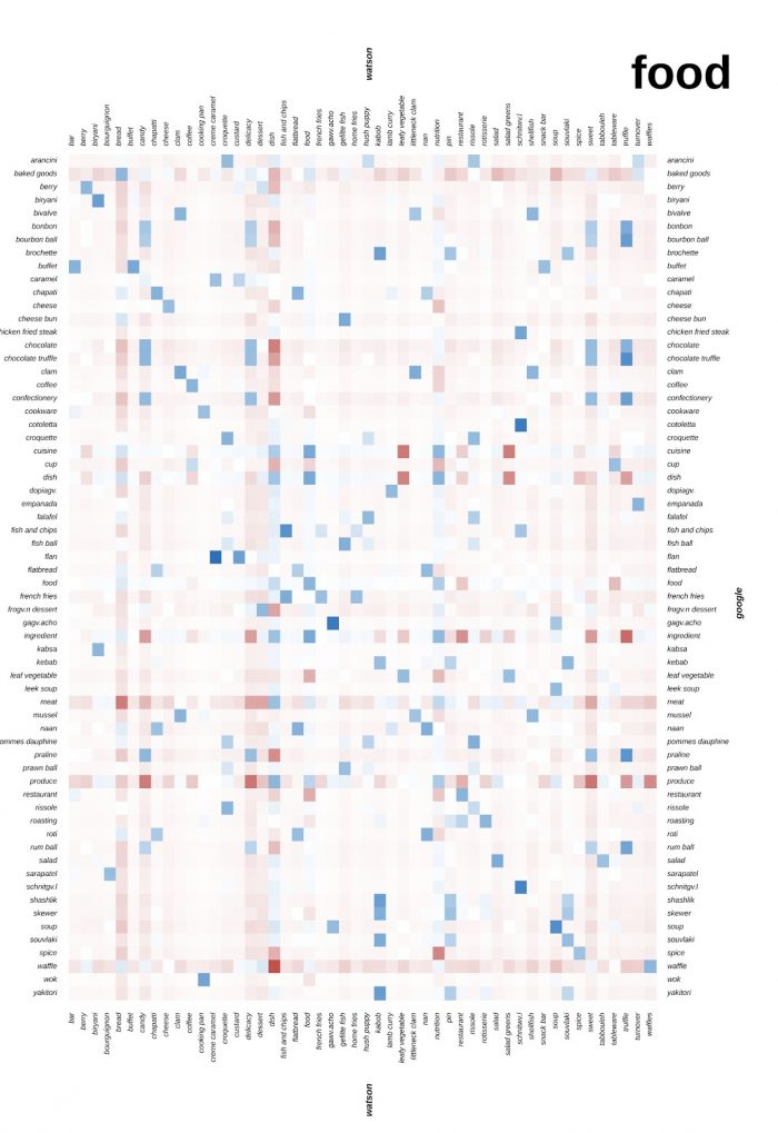
Figure 9 – Google vs. IBM correlation table. The bluer the cell, more positively correlated are the respective labels – i.e. how often the labels occur in the same image considering both APIs. Conversely, the redder the cell is, more negatively correlated are the labels – i.e. how often the labels do not occur in the same image considering both APIs.
Countries and typicality
While working within each API semantic space, we were able to draw comparisons among the representation of the four approached nationalities by the stock image sites. Image-label networks allowed us to identify topical categories within each visual dataset, and the relative predominance of each of them was taken as indicators of typicality within each national representation (Figure 10). By analyzing such networks side by side, it was possible to define common topical categories that could be observed across the datasets, given their presence and relative proeminence in all cases. Those were: ‘nature’, ‘food’, and ‘people’. Additionally, through this analysis one unique category was also identified for each dataset: ‘carnival’, for Brazilian; ‘textile’, for Portuguese; ‘city’ for Austrian; and ‘money’ for Nigerian.
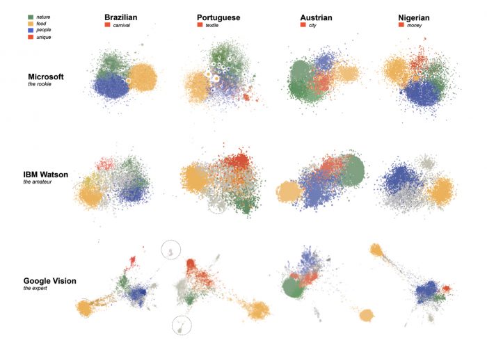
Figure 10 – Matrix of bipartite image-label networks for each nationality dataset and each vision API. Each network is comprised of 4,000 image nodes and varying number of labels nodes and edges, according to API specificities. The networks were spatialized with ForceAtlas2 algorithm within Gephi. Clusters were color coded according to the identified topical categories.
The categories had varying distributions among the datasets, but could be said to be somewhat balanced. Austrian dataset has a remarkably large ‘nature’ cluster, whereas it has a small ‘people’ cluster and a pronounced unique ‘city’ cluster. In the Portuguese dataset, the people cluster is nearly absent and was not so clearly defined across the different vision APIs. For this case, its unique ‘textile’ cluster was more prominent than all other unique clusters, which makes reference to the traditional and historical Portuguese Azulejos. In the Nigerian and Brazilian datasets, ‘people’ was the most pronounced cluster, together with ‘food’.
Evidently each of those groupings had remarkably different compositions for each nationality, considering both the typical images and the labels that were more frequent among them. Browsing through the images pertaining to each of those categories, we were able to identify the most typical expressions of them for each of the nationalities (Figure 11). Label frequency analysis, done through textual analysis methodologies, was also important for achieving a more detailed account of the APIs labeling of each dataset and, thus, of their visualities (Figure 12).
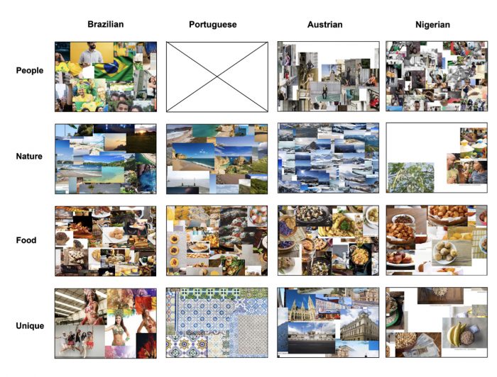
Figure 11 – Matrix of details of the image-label networks with the actual images plotted onto the image nodes. Images pertaining to each topical category for each nationality are made visible.
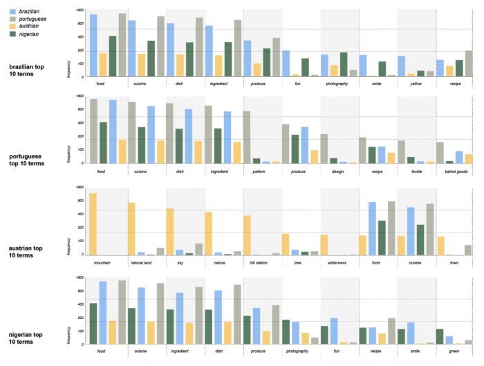
Figure 12 – Bar charts for the top 10 terms of each nationality dataset compared to their occurrence in every other nationality.
Considering the joint analysis of these visualizations, findings related to the descriptive approach of each dataset could be summarized as follows.
Brazilian: the ‘people’ cluster, one of the most pronounced, is largely composed of smiling and happy people, often bearing national symbols such as the flag or national colors (green and yellow). This is perceived in the tag frequency analysis as well, which, considering Google Vision API only, shows ‘fun’, ‘smile’ and ‘yellow’ among the top ten labels. The Brazilian cuisine is featured in the also prominent ‘food’ cluster, in which a variety of national treats are depicted, such as churrasco (the Brazilian-style barbecue), pão de queijo (a cheese- and manioc-based bun), or brigadeiro (a chocolate-based sweet). It was surprising that the nature was not so prominent – the cluster is not much bigger than in the Portuguese dataset. Typically, images in this cluster depict beaches and other coastal landscapes. The unique cluster identified in this dataset was formed by carnival pictures.
Portuguese: tiles formed the most prominent and distinguished cluster in the Portuguese dataset, described by labels such as ‘pattern’, ‘design’ and ‘textile’ – within the top ten Google Vision labels for the dataset. These ceramic elements of Portuguese architecture were abundant in the stock sites’ imagery and their clustering was clearly observable in the networks generated by data from all three vision APIs. Different from the other nationalities, the ‘people’ cluster was not so well defined, which indicates that portraits were not as common within the dataset. Meanwhile, ‘food’ was a strong category, which was mostly comprised of pastry and baked goods – cakes, pastel de nata among other recipes. ‘Nature’ was not particularly prominent and was mostly related to coastal landscapes.
Austrian: it was particularly surprising that ‘nature’ stood out, by far, as the most significant cluster in this dataset. In fact, labels related to this topic, such as ‘mountain’, ‘natural land’, ‘sky’, ‘tree’, and ‘wilderness’ had the most frequent attribution in the dataset – debunking ‘food’-related ones, which were more frequent for the other nationalities. Such pictures were mostly related to alpine landscapes, which are known tourist attractions of the country. Meanwhile, ‘city’ was also a pronounced cluster, which was chosen as this dataset’s ‘unique’ example. Most of it seem related to the historical architecture of some of Austria churches and imperial palaces. The ‘people’ cluster was rather distinct, with fashion-style photography intersecting with the ‘city’ cluster. Meanwhile, the ‘food’ cluster was composed by a variety of savoury and pastry specialties.
Nigerian: the ‘people’ cluster was by far the most pronounced in the dataset. Mostly comprised of posed portraits with positive facial expressions and in different contexts, often work-related. This is also perceivable in the most frequent labels attributed to the dataset, for which ‘smile’ is one of the most frequent ones – following the food-related group. The ‘nature’ topic is significantly underrepresented and pictures are often less about natural landscapes than agricultural contexts. The ‘food’ cluster appears to be mostly comprised of national cuisine and traditional dishes. However, both for this case and for the unique cluster identified for this dataset, the lack of contextual knowledge hindered our interpretative capacity. In the case of the latter, we have found a ‘money’ or ‘currency’ cluster to be rather distinguished in the analysis. Most of the pictures show some bills sided by some kind of beans. These were highly generic depictions which we presumed aimed at representing an aspect of Nigerian economy and agriculture, but we were unable take the analysis further.
These descriptions indicate some of the typical features of the images provided by the stock image sites in response to our queries. Importantly, thus, they are not descriptions of each country’s visuality but, rather, of the visuality that is constructed through the complex mediation of the stock image sites themselves. As a second layer of mediation, it is also important to observe the role of the computer vision APIs in assigning labels which are then used to group such pictures which were categorized in the analysis. However, taking in account all these entanglements, the achieved descriptions seem telling of some of the overall typical figurations present in those image collections which are also indicators of a broad imaginaries surrounding those countries – with their cultural specificities but, more often, stereotypes and clichés.
A glitch in Austrian Visuality?
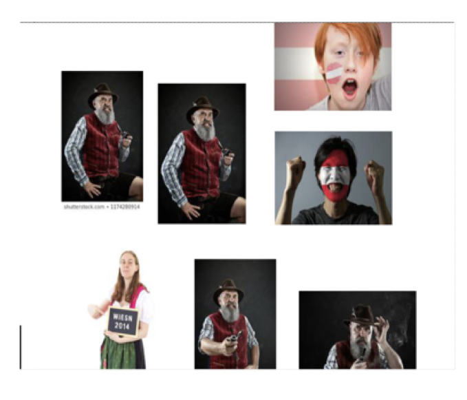
Figure 13 – Zoomed-in view of the image-plotted visualization of the image-label network of Austrian dataset
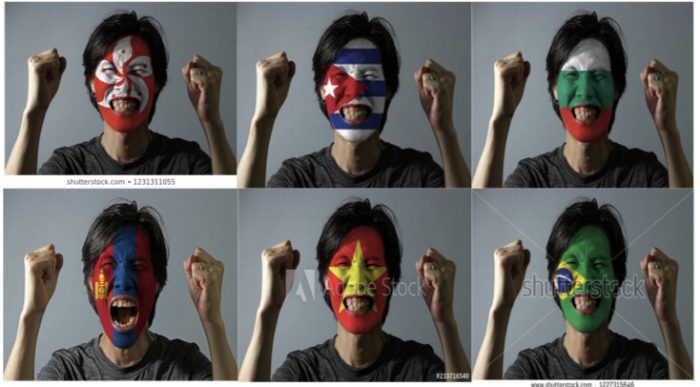
Figure 14 – Variations of the stock photo with other national flags superimposed to the model’s face.
With stock image sites offering large formations of characteristic representational elements such as flags and traditional colors, the biased rendering of nationality within the dataset poses questions of stereotyping and its treatment by the APIs. Particularly the exploration of the API lens through plotted image-label networks was helpful in detecting ‘glitches’ in the national typicality of the images. By zooming in on the flag-related cluster in the Austrian Google Vision image-label network, we were able to detect a standardized “cheerful portrait of a man” featuring an Asian model with a flag paint for Austria Photoshopped onto his face.
Unsurprisingly, a reverse Google Image search returned us multiple examples of the same stock image to be reused for purposes of representation across different nationalities. In the API-mediated figurations of what the image shows, Google Vision focuses on the “face” and related labels such as “mouth” and “nose” while also recognizing “fun” in the image. Watson Vision offers an alternatively weighted categorization by labelling the image with “greasepaint makeup”, “cosmetic”, “dark red color”, “entertainer” and “clown”. Microsoft Vision identifies a “person” and a “man” without offering any further labels.
Google Cloud Vision API: face, head, nose, mouth, fun, jaw, headgear, hand, gesture, photography
IBM Watson Visual Recognition API: greasepaint makeup, makeup, cosmetic, toiletry, clown, entertainer, person, dark red color
Microsoft Azure Computer Vision API: person, man
Considering that, apparently, it takes an Asian male model to express “fun” and “entertainment” across nationalities, this example points us towards wider entanglements of the “racio-visual logic of the internet” (NAKAMURA, 2008), requiring further explorations of digital image infrastructures as mediators of cultural stereotypes and/or diversity.
Cultural specificity and biases
Pastel de Nata

Figure 15 – Pastel de nata picture from Shutterstock
Pastel de Nata (Figure 15) is a famous traditional Portuguese pastry which was abundant in the Portuguese dataset. It had been a preliminary case study for the project pitch as one case in which the labeling by vision APIs seemed unable to accurately recognize the delicacy. In order to further assess this preliminary finding, other images depicting it were sought within the dataset and labels attributed to them by each API were collected. Considering three of those images, we have found the following labels.
Google Cloud Vision API: dish, food, cuisine, ingredient, egg tart, baked goods, dessert, custard tart, pastel
IBM Watson Visual Recognition API: brioche, bun, bread, food product, food, Yorkshire pudding, quick bread, reddish orange color, light brown color
Microsoft Azure Computer Vision API: food, doughnut, donut
From these outputs, it was clear that the API which presented the most precise tagging was Google’s. Not only had it recognized it as ‘custard tart’, which is a more generic name of the recipe which is also applied for similar pastries from England and France, it had also attributed the label ‘pastel’ which is more culture specific. IBM Watson classified them as brioche bun and yorkshire pudding, which are not the same treat nor have the same cultural origin, but which have a similar shape to the Pastel de Nata. Microsoft Azure Computer Vision used the descriptions: doughnut and donut, which are very different desserts compared to the typical portuguese sweet and typically related to United Statesian culture.
Cavaquinho

Figure 16 – Samples of Cavaquinho pictures from Shutterstock
Cavaquinho is a traditional musical instrument in Brazil, although originally from Portugal. It is a high-pitched four-strings instrument which resembles a small guitar and which typically integrates samba and chorinho ensembles. In previous methodological steps, the study had found that musical instruments was a significant topical cluster in the Brazilian dataset. It was also found that musical instruments had quite different standings in each of the APIs’ semantic spaces, with Google attributing a wide variety of labels within that topic when compared to other APIs. Given the cultural specificity of the cavaquinho, as well as its close resemblance to other instruments – such as the traditional guitar or the Hawaiian ukulele – it was chosen as a case study for the matter of cultural specificity.
Considering the three pictures shown in Figure 16, these are some of the labels attributed by each API:
Google Cloud Vision API: string instrument, musical instrument, plucked string instruments, guitar, tiple, string instrument accessory, bandurria, acoustic-electric guitar, vihuela, cavaquinho, acoustic guitar, ukulele, banjo guitar
IBM Watson Visual Recognition API: stringed instrument, musical instrument, reddish brown color, guitar, beige color, resonator, system, cavity resonator, enclosure
Microsoft Computer Vision API: indoor, table, sitting, wooden, instrument, brown, plate, desk, guitar, computer, mouse, laying, white, small, board, apple, cutting, cat, laying, motorcycle, bicycle, large, holding, standing, man, room
As expected, generic labels were present across the APIs, such as ‘string instrument’ or ‘musical instrument’. These are also arguably more cultural neutral, as they do not specify the instruments but only their broad categorization. The guitar was also attributed by all three APIs, which is also expected given cavaquinho’s visual resemblance to it and the labeling algorithms likely insensitivity to changes of scale. However, Google’s output was able to identify the precise tag of ‘cavaquinho’, although it had also mistakenly attributed several other cultural specific labels for similar stringed instruments, such as the ukulele, tiple, bandurria and vihuela. Other labels such as ‘banjo guitar’ were accurate in this case given that a banjo was also present in one of the pictures. It is significant, that so many cultural specific labels are part of the APIs ontology, even if it is not too precise in their attribution. IBM and Microsoft were limited to generic labels and Microsoft showed significant inaccuracy in its labelling – such as in its attribution of bicycle, motorcycle, computer and mouse.
Black hair, wig and turban
Another matter approached in the study concerns how computer vision APIs label non-white racial features and non-Western garments. The cases in point emerged from an exploratory assessment of the depiction of black and indigenous people within the Brazilian and the Nigerian datasets and their labeling by the studied APIs. While navigating through pictures of black people, an observation soon emerged regarding how hair and garments were labeled, particularly by Google Cloud Vision API.
We have found that the label ‘wig’ was consistently attributed to black women with frizzy hair or wearing turbans, beyond the attribution of the label “Dastar” in the Brazilian Bahians turbans, when in fact Dastar is a specifically indian turban used by adepts of Sikhism. Also on turbans, the label “fashion accessory” was frequently attributed for clothing on Nigeria dataset. That, to a certain extent, simplifies the traditional and religious meanings contained in the item. In most of the turbans of Brazilian Bahians, the labels “Tradition” and “Ceremony” appear more frequently, approaching the religious characteristics.
This brief analysis gives us some clues pointing to API limitations in the cultural sense of the their labels and lead us to questions about, for example, which of the variations of hair labels are included on the API’s and why there isn’t a label “frizzy hair” in the black women photos? How are the attire of other religions labeled in the API? There are labels about hair with implied aesthetic judgments?

Figure 17 – Sample analyzed from the Brazilian dataset.
Labels attributed by Google: Hair(0.990746), Hairstyle(0.9465719) ,Wig(0.9353447), Eyebrow(0.89324903), Forehead(0.8755422), Beauty(0.8596393), Ringlet(0.8323382), Human(0.8087015), Long hair(0.80144316 , Lip(0.79908)
 Figure 18 – Sample analyzed from the Nigerian dataset.
Labels attributed by Google: Hair(0.9741137), Face(0.9675024) ,Skin(0.95962894) ,Green(0.9285578), Beauty(0.90654385), Head(0.87623596), Human(0.7591204) ,Smile(0.75412655), Lip(0.75408006), Wig(0.6963982)

Figure 19 – Sample analyzed from the Brazilian dataset.
Labels attributed by Google: Facial expression(0.94438577 ), Turban(0.8973001), Smile(0.8669455), Headgear(0.7597292), Stock photography(0.67624575), Dastar(0.6711571), Tradition(0.6179844)
Figure 20 – Sample analyzed from the Nigerian dataset.
Labels attributed by Google: Hair(0.9663027), Clothing(0.94794667), Turban(0.94629663), Head(0.9014164) ,Beauty(0.8735063), Skin(0.8593028), Fashion accessory(0.80008006), Headgear(0.7874792), Neck(0.7371684), Jewellery(0.6752317)
The study of large visual datasets on digital platforms has focused on quantifiable aspects of the environment and/or interfaces themselves (Laestadius, 2017). Mixed methodologies such as our approach to visual network analysis empower the researchers to switch constantly between levels of data visualization and exploration. Digital networks can generate unique insights through the spatialization and modularity of tens of thousands of images. At the same time, these networks allow for filtering to specific instances related to a theme or context.
We discovered patterns regarding what is commonly related to different countries through their demonyms. Food, Nature and People emerged as salient categories in each of the four countries/demonyms. Since of all those categories are related to concepts usually perceived as linked to places and cultures, we consider that this indicates the adequacy of the employed methods for comparing cross-national representations.
Concomitantly, the unique categories pointed to particular findings. In each country emerged a specific theme linked to their culture and tourism strategies (and stock photo demands). While positive and negative stereotypes play a relevant role in those categories (such as ‘Carnival’ for Brazil), the offer of photo albums by photographer and studios could have biased some results. In the case of Nigeria and Austria, for example, prolific photo albums directed the dataset (and their images and labels) to accentuate their subjects. This highlights an important variable not included in the study: the ratio between the amount of images on the platform under scrutiny and the amount of producers. That is, in our project: if less content producers use a search query/tag, each unique producer can greatly influence the analysis. To further study this issue, future studies can compare periphery countries with hegemonic countries in the global media industries (e.g. USA, UK, Japan).
Regarding the computer vision providers, the study shed light on their differences, limitations and ways of repurposing them for exploring culture and representations embedded in digital platforms with digital methods. Commercial services like Google Cloud Vision API, Microsoft Azure Computer Vision API and IBM Watson Visual Recognition API are considered “black boxes” (Pasquale, 2015; Buolamwini & Gebru, 2018), and the auditing of their precision or coverage is hampered by the lack of transparency. Neither the list of labels, tags or classes nor their total amount are disclosed by the providers. We hope studies like ours add up in the pool of cases to help other researchers interested in using computer vision APIs to social research. Also, different API providers don’t overlap or match their understanding of complex cultural data such as images, so using them uncritically can be a methodological problem.
The tentative categorization of the image tagging coverage and quality (“rookie”, “amateur”, “expert”) between the three providers does not mean that one of them should be preferred nor that researchers should use only one in their projects. Some of the procedures performed during our study (e.g. clustering dictionary) shows the feasibility of combining two or more providers merging the annotated datasets and networks. Further experimentation with other AI providers is recommended to broaden the scope of the discoveries.
Topic expert researchers can lead to multifaceted inquiry on datasets. Cross-national comparisons with cross-national teams can further advance the understanding of both the method (computer vision) and object (stock photos).
Finally, cultural stereotypes and “typicality” about a country and their population are reproduced in content providers, so understanding the ways it happens is important for a fair media ecosystem. Stock photos providers are important for publishers, advertising, public relations and editorial agencies around the world and the microstock business model extends their impact also to small and medium business and public institutions, making the understanding of their visual culture and routines especially important due to their pervasiveness.
Aiello, G. et al (2016). A critical genealogy of the Getty Images Lean In Collection: Researching the feminist politics of stock photography across representation, circulation and recontextualization. Digital Methods Winter School project. Available at https://wiki.digitalmethods.net/Dmi/WinterSchool2016CriticalGenealogyGettyImagesLeanIn
Aiello, G. et al (2017). Taking Stock: Can News Images Be Generic?. Digital Methods Initiative. Available at https://wiki.digitalmethods.net/Dmi/TakingStock
Anastasopoulos, L. J. et al. (2016). Photographic home styles in Congress: a computer vision approach. arXiv preprint arXiv:1611.09942, 2016.
Blondel, V. D., Guillaume, J.-L., Lambiotte, R., & Lefebvre, E. (2008). Fast unfolding of communities in large networks. Journal of Statistical Mechanics: Theory and Experiment, 2008(10), P10008. https://doi.org/10.1088/1742-5468/2008/10/P10008
Buolamwini, J. A. (2017). Gender shades: intersectional phenotypic and demographic evaluation of face datasets and gender classifiers (Doctoral dissertation, Massachusetts Institute of Technology).
Buolamwini, J. & Gebru, T.. (2018). Gender Shades: Intersectional Accuracy Disparities in Commercial Gender Classification. Proceedings of the 1st Conference on Fairness, Accountability and Transparency, in PMLR 81:77-91
Bucher, T. (2013). Objects of Intense Feeling: The Case of the Twitter API. Computational Culture, (3). Retrieved from http://computationalculture.net/objects-of-intense-feeling-the-case-of-the-twitter-api/
D’Orazio, F. (2013). The future of social media research: Or how to re-invent social listening in 10 steps. Pulsar Platform Blog.
Geboers, M., Andelsman, V., Bainotti, L., Banal, M., Brans, E., Campagna, T., Chand, K., Chateau, L., Dashkina, R., Fan, J., Goswami, S., Schossboeck, J., Shi, J. (2019). Mapping affect: exploring new protocols for visual analysis. Digital Methods Initiative Winter School Wiki. University of Amsterdam, Amsterdam. Retrieved from: https://wiki.digitalmethods.net/Dmi/MappingAffect
Hendricks, L. A., Burns, K., Saenko, K., Darrell, T., & Rohrbach, A. (2018). Women also snowboard: Overcoming bias in captioning models. In European Conference on Computer Vision (pp. 793-811).
Hussain, Z. et al. (2017). Automatic understanding of image and video advertisements. In: 2017 IEEE Conference on Computer Vision and Pattern Recognition (CVPR). p. 1100-1110.
Jacomy, M., Venturini, T., Heymann, S., & Bastian, M. (2014). ForceAtlas2, a continuous graph layout algorithm for handy network visualization designed for the Gephi software. PloS One, 9(6), e98679. Retrieved from http://journals.plos.org/plosone/article?id=10.1371/journal.pone.0098679
Karako, C., & Manggala, P. (2018, July). Using Image Fairness Representations in Diversity-Based Re-ranking for Recommendations. In Adjunct Publication of the 26th Conference on User Modeling, Adaptation and Personalization (pp. 23-28). ACM.
Joo, J., Li, W., Steen, F. F., & Zhu, S.-C. (2014). Visual Persuasion: Inferring Communicative Intents of Images (pp. 216–223). Proceedings of the IEEE Conference on Computer Vision and Pattern Recognition. Retrieved from http://openaccess.thecvf.com/content_cvpr_2014/html/Joo_Visual_Persuasion_Inferring_2014_CVPR_paper.html
Laestadius, L. (2017). Instagram. In: Luke Sloan & Anabel Quan-Haase (eds.). The SAGE handbook of social media research methods, 573-592.
Marres, N., Moats, D. (2015). Mapping Controversies with Social Media: The Case for Symmetry. Social Media + Society 1(2).
Nakamura, L. (2008) Digitizing Race. Visual Cultures of the Internet. London: Minnesota.
Napoli, P. M. (2008). Toward a model of audience evolution: New technologies and the transformation of media audiences. McGannon Center Working Paper Series, 15.
Omena, J. J., Rabello, E., Mintz, A., Ozkula, S., Sued, G., Elbeyi, E. & Cicali, A. (2017). Visualising hashtag engagement: imagery of political polarization on Instagram. Digital Methods Initiative Summer School Wiki, University of Amsterdam. Amsterdam. Retrieved from: https://wiki.digitalmethods.net/Dmi/InstagramLivenessVisualisingengagement
Osoba, O. A.; Welser IV, W. (2017). An intelligence in our image: The risks of bias and errors in artificial intelligence. Rand Corporation.
Pasquale, F. (2015). The black box society. Harvard University Press.
Porikli, F., Shan, S., Snoek, C., Sukthankar, R., & Wang, X. (2018). Deep learning for visual understanding: Part 2 [from the guest editors]. IEEE Signal Processing Magazine, 35(1), 17-19.
Ricci, D., Colombo, G., Meunier, A., Brilli, A. (2017). Designing Digital Methods to monitor and inform Urban Policy. The case of Paris and its Urban Nature initiative. In: Proceedings of the 3rd International Conference on Public Policy (ICPP3). Retrieved from: https://www.academia.edu/33729733/Digital_Methods_for_Public_Policy_Designing_Digital_Methods_to_monitor_and_inform_Urban_Policy._The_case_of_Paris_and_its_Urban_Nature_initiative
Rogers, R. (2013). Digital Methods. Cambridge, MA: MIT Press.
Rosa, J.M., Omena, J. J., & Cardoso, D. (2018). Watchdogs in the Social Network: A Polarized Perception?. Observatório (OBS*) 12 (5). http://obs.obercom.pt/index.php/obs/article/view/1367/pdf
Rykov, Y. et al. (2016) Semantic and geospatial ,mapping of Instagram Images in Saint-Petersburg. In: Proceedings Of The Ainl Fruct 2016 Conference Saint-petersburg, Russia, 10-12 November 2016. Retrieved from http://ieeexplore.ieee.org/servlet/opac?punumber=7889413.
Silva, T, Apolonio, B., Meirelles, P. (2018). Visão Computacional nas Mídias Sociais: estudando imagens de #férias no Instagram. Anais do I Encontro Norte-Nordeste da ABCiber. São Luís.
Smeulders, A. W. M. et al. (2000) Content-based image retrieval at the end of the early years. IEEE Transactions on Pattern Analysis and Machine Intelligence 22(12). pp. 1349–1380, 2000. http://ieeexplore.ieee.org/document/895972/
Tifentale, A., Manovich, L. (2015). Selfiecity: Exploring photography and self-fashioning in social media. In: Postdigital Aesthetics. [s.l.] : Springer. pp. 109–122.
Venturini T. et al. 2015 (2015). Visual Network Analysis. SciencesPo Media Lab working paper. http://www.tommasoventurini.it/wp/wp-content/uploads/2014/08/VenturiniJacomy_Visual-Network-Analysis_WorkingPaper.pdf
Venturini, T., Jacomy, M., Bounegru, L., Gray, J. (2018). “Visual Network Exploration for Data Journalists,” In Scott Eldridge II and Bob Franklin (Editors), The Routledge Handbook of Developments in Digital Journalism Studies. London: Routledge, pp. 265-283.
Wang, J., Zhang, S., Martin, R. (2015). New advances in visual computing for intelligent processing of visual media and augmented reality. Science China Technological Sciences 58(12). pp. 2210-2211.
West, C. (2018). The Lean In Collection: Women, Work, and the Will to Represent. Open Cultural Studies, 2(1), 430-439.
Wieringa, M., van Geenen, D., van Es, K., van Nuss, J. (2019). The Fieldnotes Plugin: Making Network Visualization in Gephi Accountable. In Angela Daly, S. Kate Devitt & Monique Mann (eds.). Good Data. Amsterdam: Institute of Network Cultures, pp.277-296.