
I WON THIS ELECTION, BY A LOT! Trump Spectacle and Memetic Antagonism on Twitter
Project leaders: Elena Pilipets & Susanna Paasonen
Team Members: Alicia Takaoka, Catarina Ferraz, Catherine Baker, Daniel Loiola, Fabrizio Defilippi, Gabriela Gruszynski Sanseverino, Giuliander Carpes, José Candeias, Lola López, Matteo Bettini, Paulina Sierra, Pernilla Severson.
Project pitch slides
Final presentation slides
Key Findings
Introduction
Research Questions
Query Design & Visual Protocol
Methodology
Findings
Discussion
References
Key Findings
The overall rhythms of exchange within the thread of replies to Trump involve largely imitative visual and textual reactions, low intensity of engagement with individual replies (with several notable exceptions), and high intensity of variation/outbidding, e.g., through repeated appropriation of popular memetic vernaculars.
Frequently occurring memetic patterns assemble a wide range of age-, race- and gender-specific references (figures 6-7) to express competing attitudes toward Trump and/or to accumulate attention through disruptive interventions, e.g. through ‘cursed images’ and copypasta tweets in Armenian, through Among Us adaptations of Trump’s iconic hair-piece and skin color, or through fictional appropriations of electoral prediction maps. Faces and fictional characters mediate users’ reactions to Trump in different overlapping affective registers, including sadness, anger and outrage (crying baby reactions comparing Trump to a spoiled child having a temper tantrum), annoyance, amusement, surprise and doubt (“Are you sure about that?” and “blinking white guy” GIFs), joyful celebration and vitriolic laughter (e.g., troll face ), and further contextual adaptations. Repetition/amplification is key in all these scenarios.
Armenian curses combine different types of visuality, including random wildlife GIFs, fictional appropriations of electoral maps, Among Us references, and multiple ‘cursed images’ belonging to the genre of creepypasta. The circulation of this imagery across platforms highlights its vernacular nature (Gibbs et al., 2015), as exemplified by a corresponding subreddit, Twitter account, Tumblr blog, Amino Apps community, and other smaller external domain archives presented in figure 13. The appropriation of cursed images in the thread draws attention to how this oddly engaging stylistic convention reemerges as a multiplicator of comic confusion/disturbance, fuelling the populist spectacle of Trump deselection.
The use of hashtags, emojis, and text indicates antagonism in the dynamics of imitation holding the thread together. Both #trump2020 and #biden2020 hashtags were used with a series of co-hashtags mocking Trump, such as #trumptantrum, #yourefired, and #delusionaldonald. Faces with tears of joy were persistent over time, supporting the absurdist humor employed in the thread along with American flags, clown, and skull emojis. Text replies offer a mixture of direct insults, Armenian curses, and weird unrelated commentary just for the lulz. Overall, the thread is a product of imitative detournement, reversal, and exposure that, albeit frequently obscure in meaning, underlines the self-amplifying (populist) character of Trump’s initial tweet.
On November 7, 2020, when US news channels declared Joe Biden the winner of the presidential election, Donald Trump reacted with three tweets firmly declaring the opposite. The one reading “I WON THIS ELECTION, BY A LOT!” gained particular visibility through over 960K replies, over 860K retweets, some 1,1M likes, and much public commentary.*** Befitting the antagonistic nature of political debate and campaigning surrounding the elections—and cutting through contemporary US politics more broadly—responses to the tweet were highly bipartisan, with some supporting Trump’s (unfounded) claims and many others jumping in to ridicule and mock him, often with the aid of memes.
Focusing on users’ quote tweets (quoted replies or retweets with comments) over a 33h period, this project sets out to examine the dynamics of exchange within the flood of animated GIFs, vitriolic commentary, cartoons, Armenian curses, and many things beyond. Attending to the rhythms, patterns, and repetitions within the dataset, we investigate different qualities of intervention emerging within the spectacle of Trump deselection.
***On January 8, 2021, following events at the U.S. Capitol, Twitter permanently suspended @realDonaldTrump for violating the company’s policy against the glorification of violence.
- What are the overall rhythms of exchange within the dataset, and how can these be analyzed as aggregate patterns?
- Which qualities of intervention and relational patterns did the event involve: How can we approach these relations as mediated by Twitter infrastructure, the content, and the context of interactions?
- How was content circulated across platforms: which other contexts/external domains fully match the images in the thread?
Query Design & Visual Protocol
Our analysis engages with a thread of quote tweets—quoted replies or retweets with comments —that were shared as direct reactions to the original tweet of Donald Trump (Figure 1). Imitative by design and intended to generate attention/amplify engagement around/through relatable topics/events/actors, the gesture of quote-tweet is a Twitter-specific form of “audiencing” (Highfield, 2013), which allows users to comment on a retweet using text, images, videos or GIFs. Unlike a reply, quote tweets show up on the main section of Twitter timelines and thus reposition topics/events/actors among users’ network of followers. Quote tweets were introduced in April 2015. Since May 2020, Twitter quantifies quote tweets, creating a separate list of quoted replies. According to techweez, these replies “sometimes end up being more popular than the quoted tweet, and it is one of the reasons Twitter is so damn addictive”.
Our dataset covers 32h of quoted replies to Trump’s “I WON THIS ELECTION, BY A LOT!” Twitter statement from November 7, 2020. It contains 63558 media items that were first assembled using Twitter quoted replies Chrome extension interacting with Twitter Standard Search API. The resulting Twitter Search URLs (“recents”, “videos”, and “photos”) were used as an input in PHANTOMBUSTER Twitter Search Export Phantom, which extracts and downloads Twitter search results in a .csv file format. Merging the files and removing the duplicates in Google Spreadsheets provided metadata (tweet date, engagement metrics, tweet content, profile name, profile URL, media URL) for 16103 images and 47455 text replies.
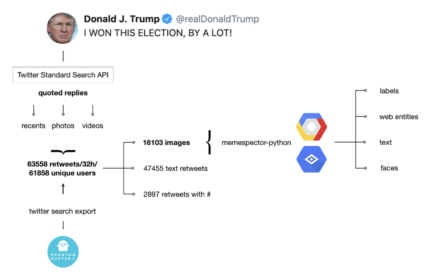
Figure 1: Query Design & Visual Protocol
To enrich the data in accordance with our research interests, in the second step, we ran all 16103 image URLs through Memespector python script, a tool processing visual content through Google Cloud Vision API. The use of the script resulted in a new .csv file containing data provided by the following Google Vision API features:
- Detect labels: entities represented in an image, across a broad group of primary categories (such as objects, body parts, locations, activities, animal species, products, etc.)
- Detect web entities: web references to an image (e.g., “Biden meme” instead of “spokesperson” or “Spider-Man” instead of “fictional character”)
- Detect other sites hosting the images: External image URLs that fully or partially match the image in the request (external domains)
- Detect text: entire text strings, as well as individual words contained in an image (e.g., text contained in the screenshots)
- Detect faces: confidence values for faces and associated facial attributes + likelihood ratings for “joy”, “sorrow”, “anger”, and “surprise” (experimental)
- Visualise and analyse aggregate patterns in
a). intensity of engagement with replies/content themes using time of posting, engagement metrics and Google Vision API labels (Google Spreadsheets + RawGraphs)
b). visuality of replies using the average hue of images and time of posting (Google Spreadsheets +Image Plot)
- Identify relational patterns and qualities of intervention in the thread using combinations of qualitative thematic coding, digital methods and automated annotation of platform-mediated data:
a). create image mood boards/heat maps focusing on memetic scenarios of Trump deselection (use emojis, post captions, hashtags, web-entities, engagement metrics, etc. to organise images in Google Spreadsheets)
b). build, explore and interpret co-hashtag, image-hashtag, actor-image, image-label, image-web-entity, etc. networks (Table2Net, Gephi)
c). Use post captions to identify and visualize frequently used word pairs in a rankflow (Text Analysis tools + Google Spreadsheets)
- Identify external domains fully or partially matching selected images from the thread using Google Vision APi data and network analysis (Table 2 Net, Gephi)
Aggregate patterns
The overall rhythms of exchange within the thread involve largely imitative visual and textual reactions, low intensity of engagement with individual replies, and high intensity of variation/outbidding, e.g., through repeated appropriation of popular memetic vernaculars.
A list of 20 most retweeted replies was created and annotated in accordance with valence about election results (positive/contra Trump or negative/pro Trump). A selection of these replies highlighting four temporal fragments of the thread is featured in figure 2 (a, b, c, d). All four fragments were visualized using RawGraph’s bee swarm chart in accordance with the temporality of replies and intensity of engagement quantified by the count of retweets. The data was structured in Google Spreadsheets (according to time) and a separate column “theme” was created to color the charts according to a selection of memetic scenarios.
Three main memetic scenarios could be identified based on the repetitions in use of specific visual references (filtered using Google Vision (GV) web entities; GV labels/GV text in image) and tweet text in Armenian: Electoral maps, Among Us memes, and Armenian curses. Both electoral maps and Among Us memes were appropriated for sharing Armenian curses with two peaks of activity at 6 and 11 pm.
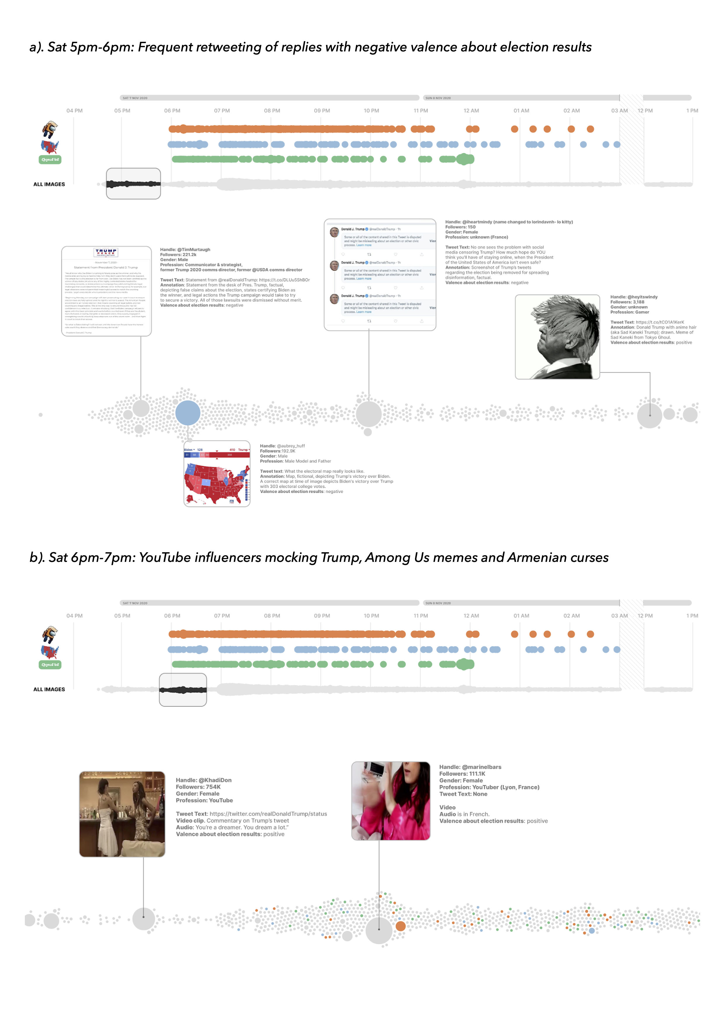
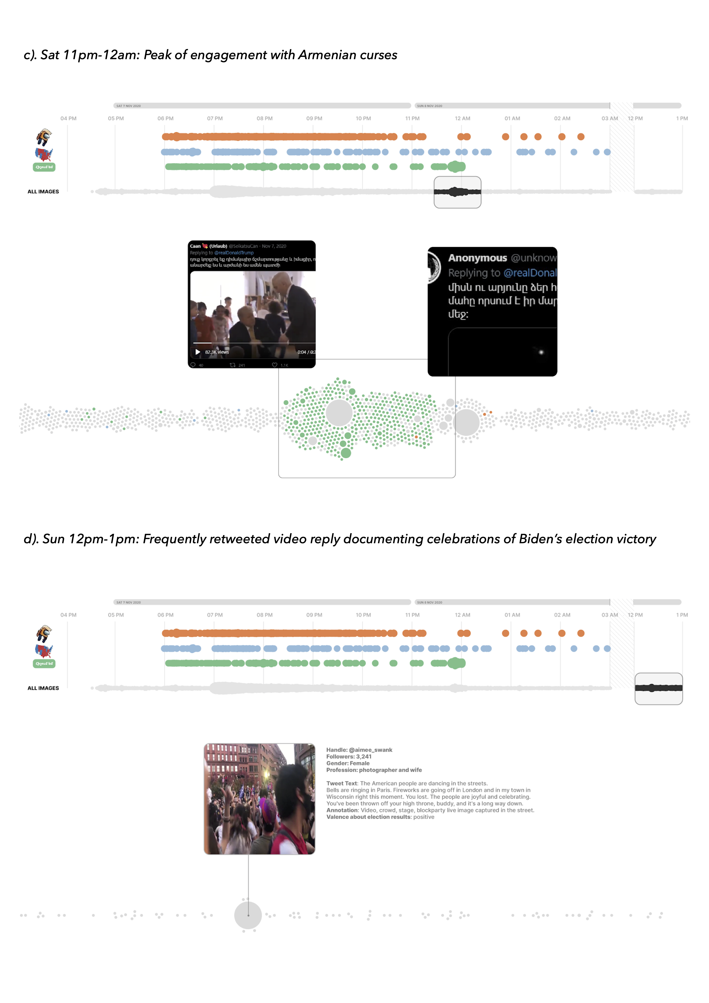
Figure 2: Raw Graph’s bee swarm charts focusing on four temporal fragments of the thread (a,b,c,d) and highlighting three main memetic scenarios in combination with most retweeted replies. Beeswarm units were grouped per hour, sized by the count of replies and colored by memetic themes: Thematic coding based on GV web entities for ”Among Us” (orange), GV labels for “map” (blue) and Tweet text in Armenian (green).
Three most retweeted replies posted between 5 and 6 pm on November 7 2020 support Trump. The most retweeted reply with 5807 retweets, 24601 likes, and 13646 comments contains a red-painted fictional electoral map depicting Trump’s victory over Biden. Reply text reads “what the electoral map really looks like”. Other frequently retweeted replies documented in figure 2 feature insults and/or sarcasm, celebrate Trump’s election defeat or ‘highjack’ the thread to promote influencer accounts and other unrelated issues.
The visuality of three main memetic scenarios—Electoral maps (361 replies in blue), Among Us memes (398 replies in orange) and Armenian curses (523 replies in green)—was further explored using different visualisations. The first visualisation (figure 3) assembles top 30 images for each scenario in an image grid using the image formula =IMAGE (x,y) and conditional formatting in Google Spreadsheets to create an image heat map in accordance with the count of likes per image.
The changing colours on the electoral map produced the first meme template for making alternative election results predictions. Two popular variations include fictional pro-Trump maps painted red. Other maps combine sarcasm and Trump critique with K-Pop references, animal memes, neon colours and text in Armenian.
In the second scenario, Trump moniker of “orange man” was appropriated by Among Us fans alongside a depiction of an orange-suited Crewmate with Trump’s trademark hairstyle. Among Us is an online multiplayer game in a space-themed setting and the most downloaded app as of October 2020. The majority of Among Us memes read “Orange was ejected”, reversing a pro-Trump game spam attack, which occurred several weeks prior to Trump deselection. Some of these references were used in combination with tweet text in Armenian. Others include text-in-image modifications such as “Donald Trump has been ejected from the White House”.
The third scenario features a range of random memes, Among Us and electoral map references along with uncanny or “cursed” images that were popularised on Tumblr, Twitter @cursedimages and Reddit r/cursed images. The shared feature of all images is copypasta Tweet text in Armenian (both with and without modifications; see below for more).
The color intensity of the map for top 30 images indicates that the majority of replies in all three memetic scenarios received relatively low engagement (with several exceptions; see above). Replies combining Among Us memes with Armenian curses received more engagement (range from 842 to 4062 likes) than Among Us replies without text (range from 0 to 2817).

Figure 3: Top 30 most liked Electoral Maps, Among Us memes and Armenian curses visualized in a grid (arranged and colored in Google Spreadsheets according to the count of likes per image)
The second visualization exploring the overall temporal/visual patterns of exchange within the thread offers a zoom-out view on the whole dataset, focusing on the repetition of similar images per hour based on the shared arrangements of color (figure 5). To identify the main visual patterns, we first separated the total of 16103 images in 9 different spreadsheets in accordance with the time of reply (Images that were shared on Sunday Nov 8 were treated as a singular unit). We then calculated the average hue of each image using ImagePlot, imported the values in Google Spreadsheets and sorted the images accordingly.
Our first observation was about the repetition of different color layers per hour, highlighting persistent use of (1) electoral maps, Among Us memes, and The Apprentice GIFs reading “You’re Fired!” (black & white shades); (2) faces (e.g., the “blinking white guy”) and “tantrum kid” GIFs (flesh colors); (3) typical election debate and talk show images with blue backgrounds (blue colors). Our second observation was that the second day of activity in the thread did not add any new memetic features, highlighting the imitative nature of quote tweets. Our third observation was that this visualization could have worked better. Note, however, that the technique of arranging images by color, albeit extremely helpful when working with more homogeneous datasets (e.g., images of nature, architecture or magazine covers, see e.g. Rose & Willis, 2018; Manovich, 2020), was our contingency plan.
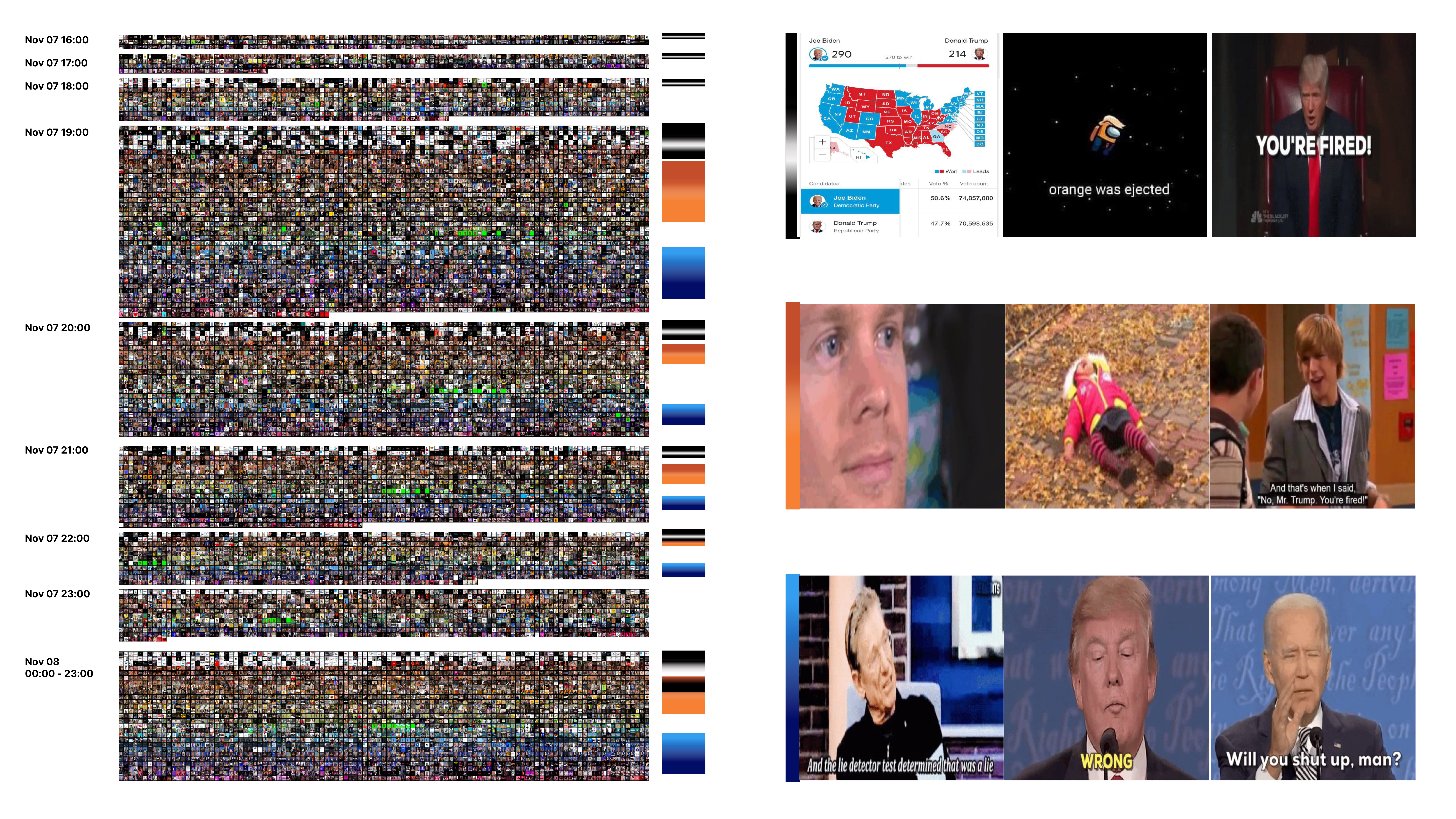
Figure 4: An image montage of 16103 images separated in temporal units by hour and arranged in accordance with color arrangements (average hue).
The main challenge of analysing large memetic datasets through aggregate visualisations is to identify repetitions based on the referential qualities of image content that different variations of the same ‘meme family’ share (consider, for instance, a group of memes featuring different characters from The Simpsons arranged in subgroups). The initial idea behind creating an image montage was therefore to use Google Vision API web entities, labels and “text in image” recognition to sort data in accordance with the repetitions in visual references to specific fictional characters, faces, memes, screenshot content, etc. (see a fragment of image montage rebuilt according to this logic here). However, during the sprint, this technique proved to be too time consuming and we only focused on the identification of memetic patterns using web entities and selected time frames.
Figure 5, for instance, presents a hierarchy of GV web entities for images of fictional characters that were uploaded between 7pm and 8pm. To filter out the data, we first extracted all images matching the GV label “fictional character” and then calculated the count of corresponding GV web entities, resulting in a tree map of 15 frequently appearing web references.
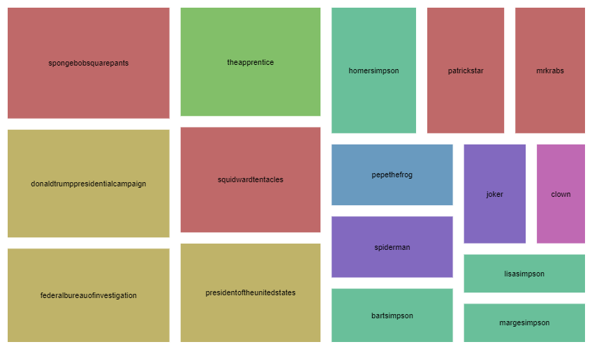
Figure 5: A treemap hierarchy of top 15 web entities for images of fictional characters uploaded between 7pm and 8 pm. Made with RawGraphs and Google Spreadsheets. Range between 42 (spongebob squarepants) and 13 (clown) occurrences. Top recurring web entities “donald trump presidential campaign”, “federal bureau of investigation” and “president of the united states” are all attributes of the same “You’re fired” GIF from The Apprentice (note that, ironically, Google identifies Trump as a “fictional character”).
Working out a hierarchy of frequently repeating images turned out to be more problematic than expected. After several unsuccessful experiments with duplicate file finder tools such as PhotoSweeper, we opted for using Google Vision web entities in parallel with verifying the selection through search filters of ImageSorter to create a rank of 50 most frequently used reactions, fictional characters, and spokespersons (figure 6).
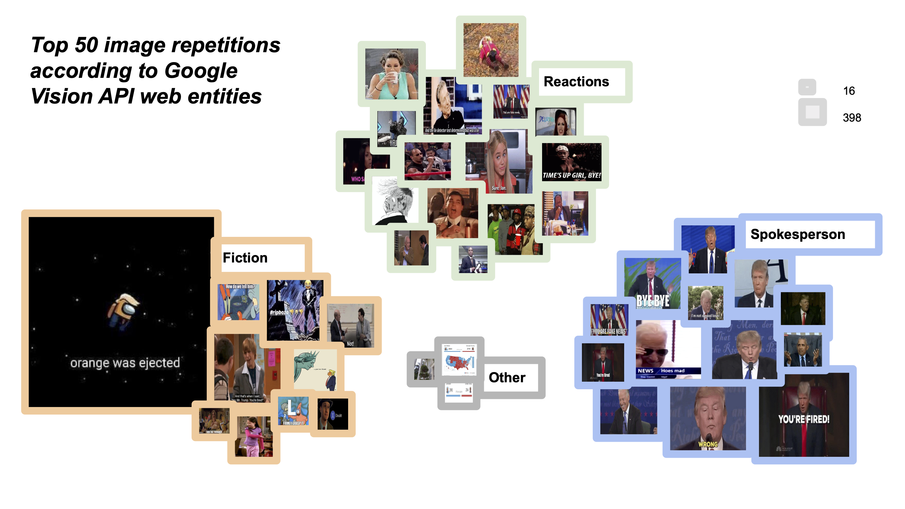
Figure 6: A hierarchy of top 50 image repetitions. Made with RawGraphs “circle packing” chart, Google Spreadsheets and verified using ImageSorter search filter. Range between 16 and 398 repetitions.
This method was however less suitable for identifying e.g., screenshots of maps and @realDonaldTrump tweets (images annotated as “other” that belong to a larger ‘family’ of memetic adaptations and require further exploration using GV “text in image” recognition). Overall, we observed that Google Vision API often annotates the same image in similar but not fully identical ways (see e.g., five different ways of annotating a Jake Ryan meme) and identifying the same group of images often requires combining different types of annotations manually (e.g., GV labels/web entities + ‘text in image’). Note, also that due to the multi-sitedness of memetic content and its embeddedness in different web locations/web reference contexts, the annotations of the same meme (and their corresponding confidence scores) vary and that the web entities with the highest score (e.g., “United States”) can be rather useless in terms of understanding the context of images that belong to a specific memetic family (e.g., Hannah Montana).
In terms of content/stance, popular scenarios of memefication presented in figure 6 assemble a wide range of age-, race- and gender-specific references to express competing attitudes against Trump and/or accumulate attention; e.g., through Among Us adaptations of Trump’s iconic hair-piece and skin color or various references to popular fictional and other subcultural vernaculars (e.g. reaction GIFs featuring “rapper Conceited showing disapproval” or “Ken Kaneki Trump expressing pain, self-pity and resignation”). Repetition/amplification is key in all these scenarios (see also Tuters & Hagen 2019).
Zoom-in perspectives:
Figure 7 highlights the social circulation of faces in the thread—a dynamic, within which faces become a common memetic object of exchange through repeated acts of sharing photographic images of others to publicly express personal feelings (see e.g., Dean 2016).
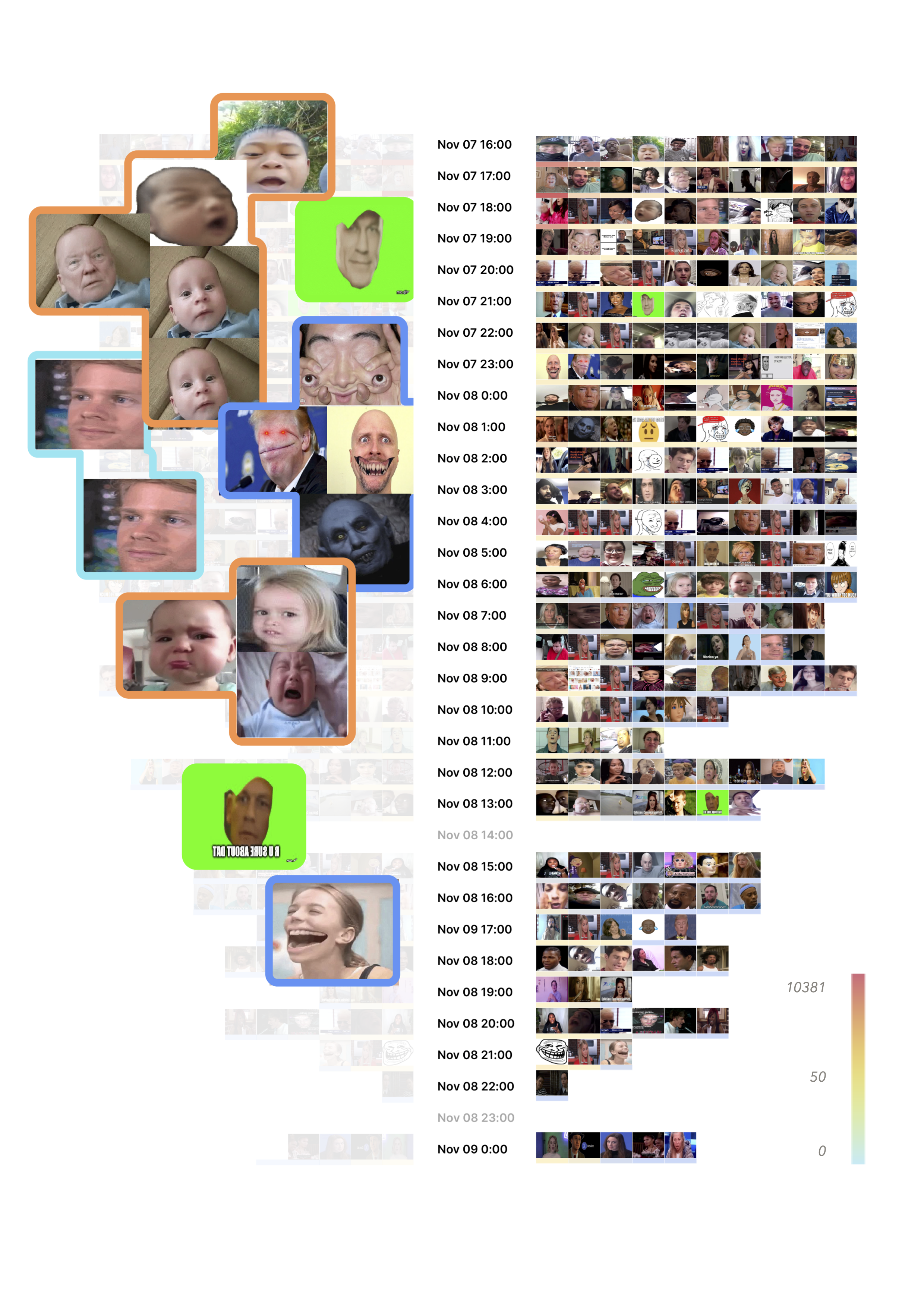
Figure 7: An image mood board zooming in on 10 most liked images of faces per hour (filtered using GV API label “face”, arranged and colored in Google Spreadsheets according to the count of likes per image).
The face mood board in figure 7 allows for two forms of reading: horizontal (focusing on the shifts in intensity of engagement with individual reactions) and vertical (focusing on the transitions in facial expressions over time). Both readings allow to spot similarities and differences in users’ attitudes towards Trump within the overall dynamic of imitation that holds the thread together. It also offers a sneak peek into the weird affective charge of “cursed images” that disrupt the thread through creepy photoshopped variations of “alien mouth GIF” (highlighted in blue).
Other recurring facial expressions mediate users’ reactions to Trump in different overlapping affective registers, including sadness, anger and outrage (crying baby reactions comparing Trump to a spoiled child having a temper tantrum), annoyance, amusement, surprise and doubt (“Are you sure about that?” and “blinking white guy” GIFs), joyful celebration and vitriolic laughter (e.g., troll face), and further contextual adaptations. In terms of data design, the method of comparing images in a grid has great potential for both meme and affect studies and can be expanded to other qualities of social media engagement such as hashtags (De Gaetano, 2019) or emojis (see figure 10).
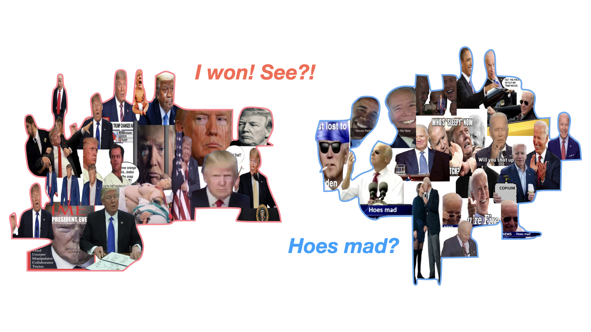
Figure 8: Two image stacks of 10 most liked images featuring Trump’s and Biden’s faces (filtered using GV label “face” and web entities for Trump and Biden). The backgrounds were removed with removebg and images were manually clustered in two composites, foregrounding memetic tactics of counter positioning Biden and Trump (winner vs loser).
Figure 8 presents another composite form (Colombo, 2018) of close-looking at the memetic techniques of counter-positioning/counterimitation through two decontextualized (removed image backgrounds) and recomposed image stacks focusing on the oppositional arrangements of sentiment as mediated through Biden’s and Trump’s faces (winner vs loser). Highlighting facial expressions as key objects memefication (e.g., through “Hoes mad” and “copium” references), this visualisation technique works best with small datasets. By layering images together to emphasize competing combinations of moods engaged in polarising events, it provides a zoom-in view on the memetic techniques that orchestrate users’ affective experiences in ambivalent ways—“ways in which one responds to particular affects with other affects—for one individual it might be shameful to be angry, while for other it might be exciting” (Gibbs 2002, 339).
The use of hashtags, emojis and text highlights antagonism in the dynamics of imitation within the thread.
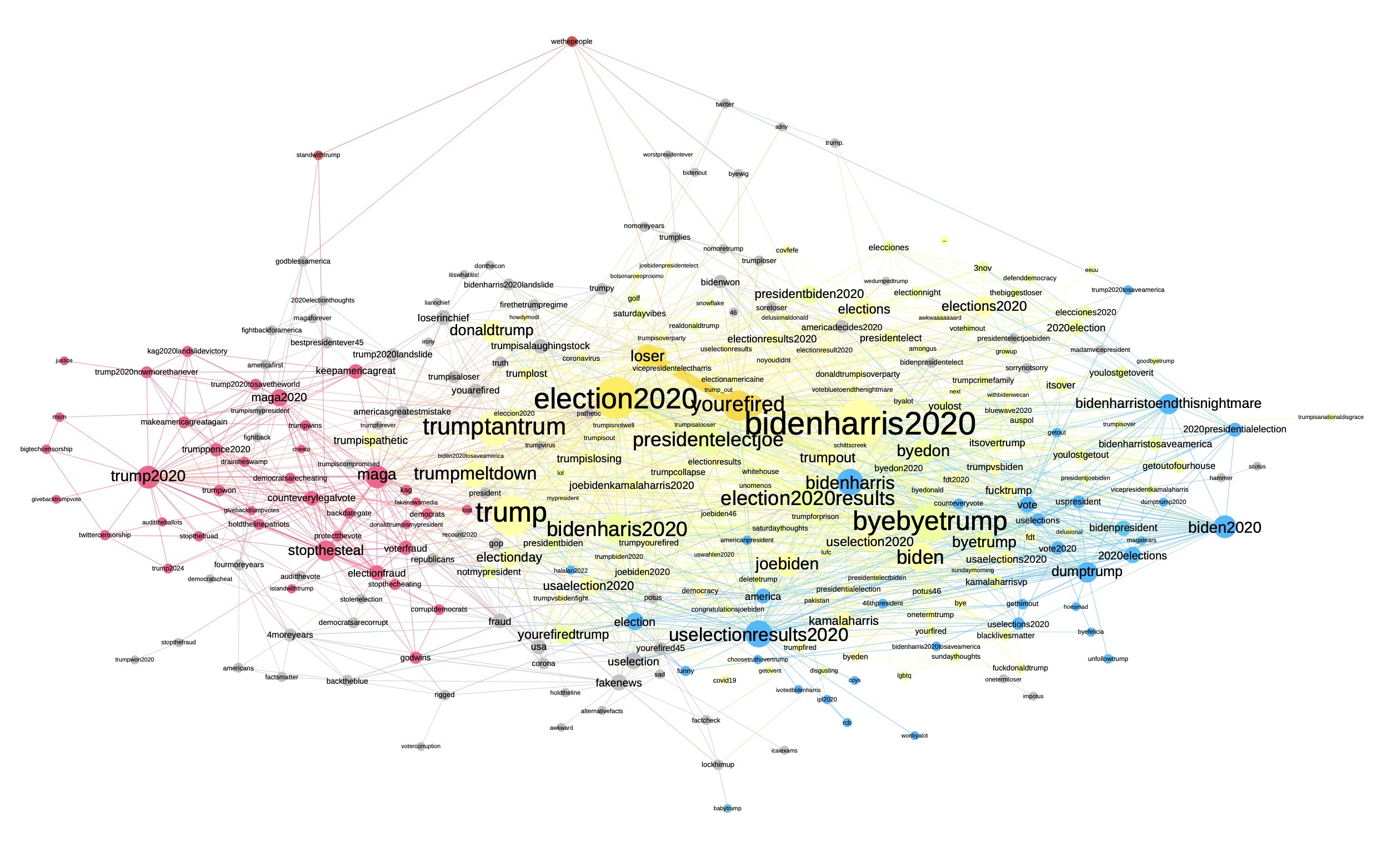
Figure 9: A co-hashtag network focusing on 290 of 1171 hashtags (giant component) and their semantic neighborhoods colored by modularity (pro-Trump hashtags in red; pro-Biden hashtags in blue, shared hashtags in yellow). Extracted from 2897 retweets, made with Google spreadsheets, Table2Net, visualized with Gephi.
Popular combinations of hashtags associated with #trump2020 include #maga and #stopthesteal. #biden2020 was co-tagged with #bidenharristoendthisnightmare and #dumbtrump. Shared hashtags include neutral #election2020results and #election2020 as well as antagonistic #trumptantrum, #byebyetrump, #trumpmeltdown and the most frequently used combination #yourefired #loser.
Emoji analysis in figure 10 shows that faces with tears of joy were persistent over time, supporting the absurdist humor employed in the thread along with American flags, clown and skull emojis (see the same data vis ‘in the making’ here). A useful alternative technique of emoji analysis to be explored in the future is emoji co-occurrence networks focusing on the clusters of emojis that are frequently used together. This technique, however, would require some adjustments in Gephi and a Twitter Streaming Importer plugin (see here).
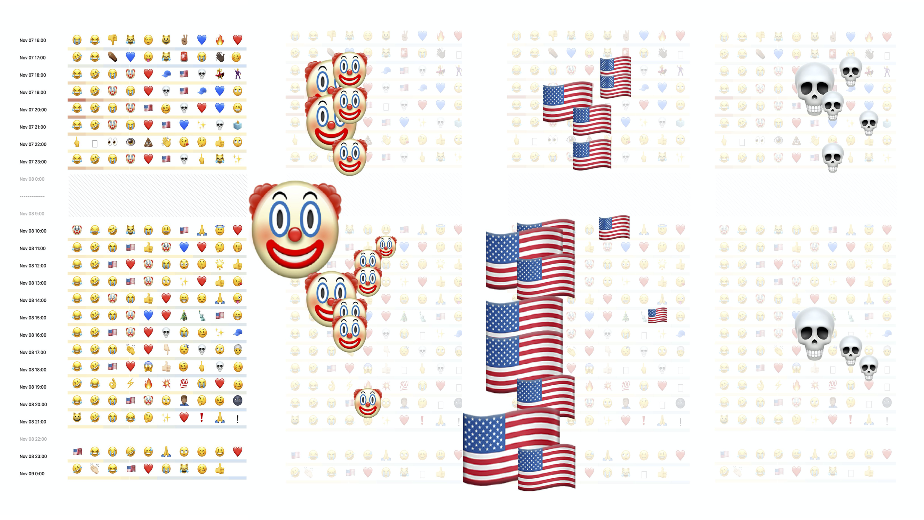
Figure 10: An emoji mood board zooming in on 10 most used emojis per hour (extracted using TextAnalysis, arranged and colored in Google Spreadsheets according to the count of emojis. Range from 1700 for 😂 at 7 pm on Saturday and 1 for 🤷🏻♀️ at 12 am on Sun).
Text replies for 47455 text retweets visualized in a treemap of most frequently used word pairs offer a mixture of direct insults, Armenian curses (see some of the variations here) and weird unrelated commentary just for the lulz (see figure 11). What this visualization clearly pushes forward is, again, both the imitative linkage between visual and textual appropriations of Trump’s populist style (e.g. “youre fired” reference from the Apprentice also appearing in figures 4, 6 and 8) and the repeated intensification of the competition between successfully established tactics of amplification/provocation (as demonstrated by the insults highlighted in red).
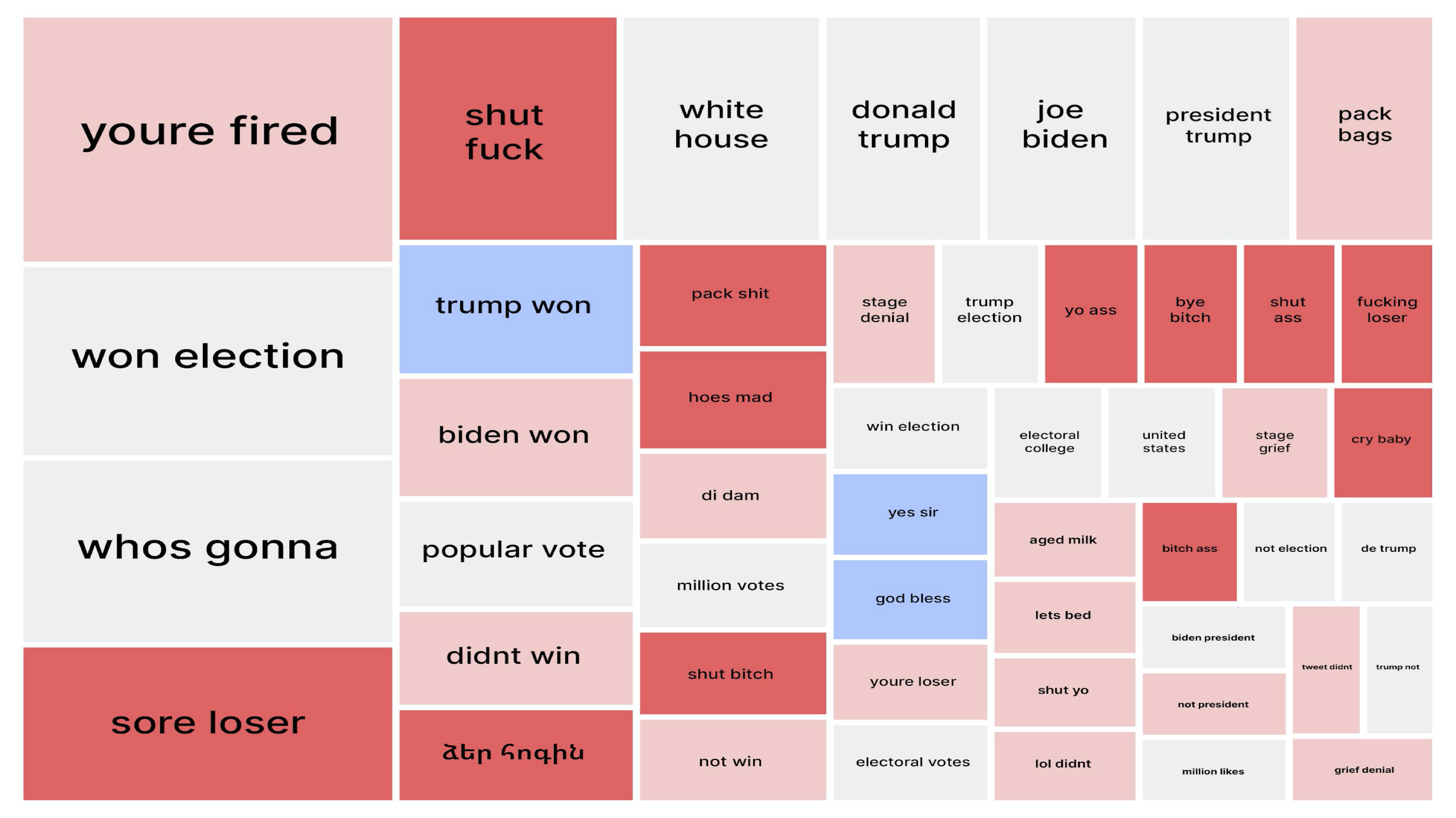
Figure 11: A treemap word pair hierarchy extracted using WordIJ from 47455 text tweets and presenting 50 most used expressions in the thread. The data was cleaned and manually coded in Google Spreadsheets by a group of scholars using four thematic codes: “insult” (red), “antagonistic” (coral), “supportive” (blue) and “neutral” (grey). Visualized in RawGraphs according to the count of word pair repetitions: Range from 515 ”youre fired” to 53 “grief denial”.
Specific interventions and image circulation
To explore the visual specifics of 523 replies in Armenian we built three different types of bipartite (two types of nodes) networks, arranging images through Google Vision API assigned labels, web entities and full matching image domains.
Figure 12 reveals some of the differences between Google vision API “labels” and “web entities” features. GV labels are assigned to images on the basis of generic descriptions pertaining to a wide range of entities. For instance, labels such as “illustration”, “font”, “cartoon” or “fictional character” are (obviously) quite common for memetic datasets, allowing to identify broad clusters of content, while adding some granularity through shared additional labels, detecting e.g., animal species, objects or colors. GV web entities are references to an image obtained from the web, providing annotations that largely depend on image locations—web domains hosting the images that fully or partially match the images from the dataset. Annotations such as “humor”, “gag”, “internet meme”, and “knowyourmeme” are thus usually the most common ones (and can be filtered out), while more specific web references allow you to focus on the actual memetic genres and characteristics or characters they assemble. Note, also, that web references can be both designative (serving to specify the content of the image, e.g., “Darth Vader”, “wedding dress”, “Lady Gaga”) and conceptual (e.g., “paranormal”, “cyberbullying”).
Exploring both networks, we found that Armenian curses feature different types of visuality, including random wildlife GIFs, fictional appropriations of electoral maps, images showing “president of the United States” (depicting both Donald Trump and Joe Biden), Among Us references, and multiple ‘cursed images’ belonging to the genre of creepy pasta. According to KnowYourMeme, cursed images are “generally pictures or photographs that are seen as disturbing to the viewer, either due to the poor photo quality or content within the image that is abnormal or illogical”. Using web entities, we thus (not unexpectedly) could also locate image groups corresponding with annotations such as “demonic possession” and “evil laughter”. In many cases, however, extremely photoshopped images were assigned only several broad annotations (such as “knowyourmeme”, “reddit”, “internet meme” or “humor”). Overall, the appropriation of cursed images in the thread draws attention to how this oddly engaging stylistic convention reemerges as a multiplicator of comic confusion/disturbance, fuelling the populist spectacle of Trump deselection.
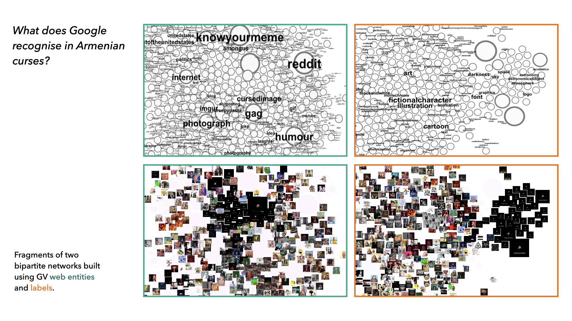
Figure 12: Fragments of two bi-partite image networks focusing on the distribution of images according to GV labels “fictional character” and web entities related to “cursed image” (E.g.: “darkness”, “font”, “space” and “astronomy” are all labels corresponding with “Among Us” web references; the broad label “fictional character” contains specific web entities such as “cursed image” and “creepy pasta”). Image nodes are sized by the count of likes. Built using Google Spreadsheets, made with Google spreadsheets, Table2Net, visualized with Gephi.
The third technique of visual exploration through computer vision pertains to the multisitedness of the digital image by using web detection of external web domains that host images fully matching the images in the dataset. Arranged in a network, image-domain clusters can point to the distinct visuality of memetic genres that are specific for different platforms—through (1) clusters of images that stick only with one particular platform, (2) clusters images that appear across multiple sites of image circulation, including mainstream platforms and other web domains or (3) individual images (outliers) that appear only in specific websites (figure 13).
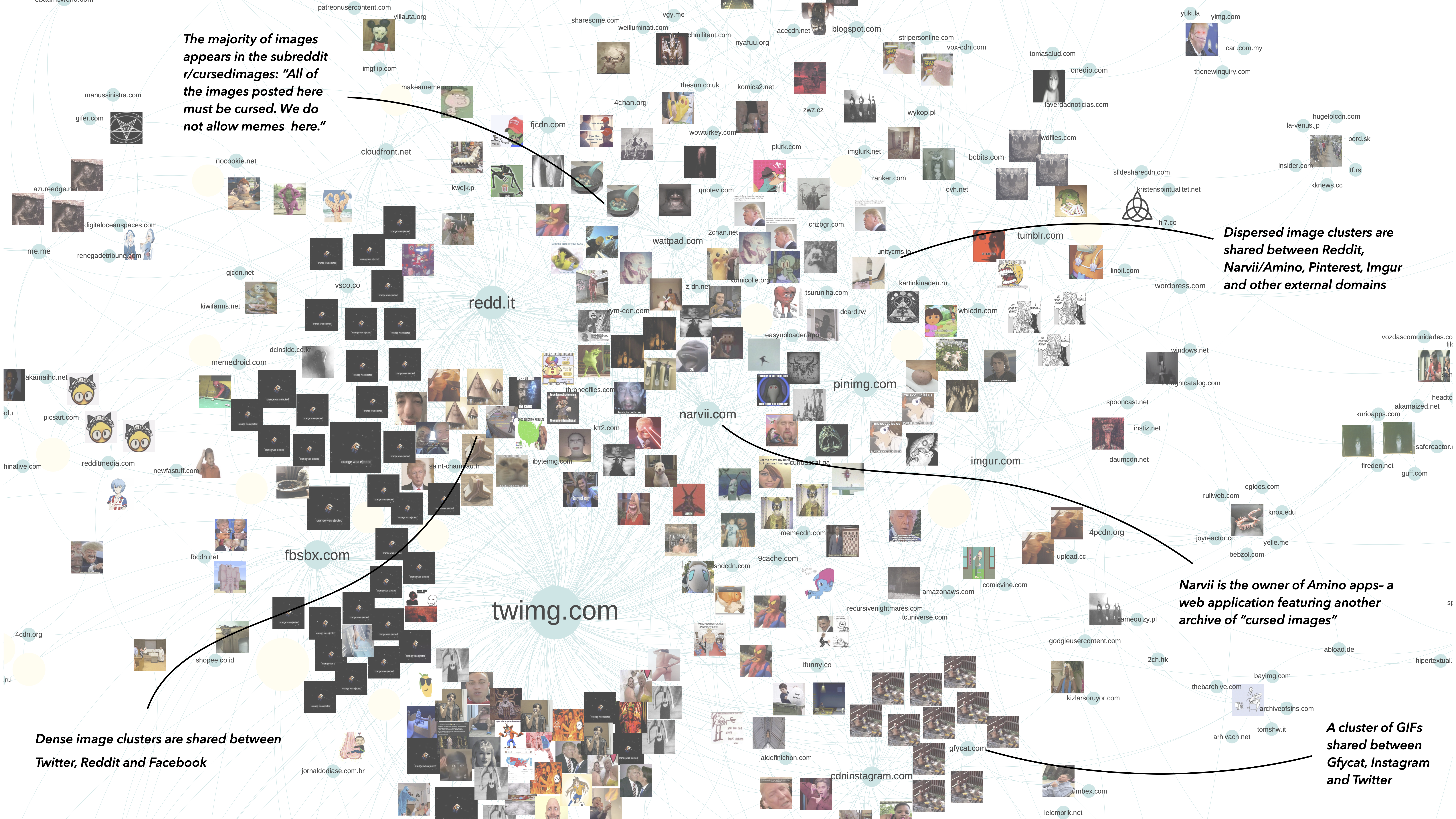
The circulation of “cursed images” across platforms highlights the genre’s vernacular nature (Gibbs et al., 2015), as exemplified by a corresponding subreddit, Twitter account, Tumblr blog, Amino Apps community, and other smaller external archives presented in figure 13.
The acknowledgement of medium and context specificity in making sense of memes through machine vision is thus central. Both GV labels and web entities require qualitative interpretation, involving different techniques of cross-reading and method combination. Figuring out what GV “label” and “web detection” modules recognize in a set of images and what they leave out is an important step in understanding the embeddedness of digital images in the specific cultures of Internet use: The exploration of relations between visual, textual and material properties of large image collections through different types of machine vision-based networks allows us a better understanding of networked visual content, its socio-technical environments and sites of circulation. At the same time, this understanding is based on a series of selective steps that try to grasp an open situation of image circulation/memetic appropriation through a collection of technically mediated perspectives. Transitions between different layers of data interpretation (close-distant, human-machine) accordingly not only convey situated knowledge, but should also be at the center of methodological reflection.
The research project shows that short-lived events of peak intensity can be an interesting entry point for exploring the dynamics of social imitation/affective intervention through images. The study of memes circulating within these dynamics requires a mix of close and distant readings pertaining to the multi-layered, contextual and platform-mediated specificity of visual interactions. During the sprint we experimented with different techniques of visualisation, each applying a new lens to the dataset (temporal frameworks, engagement metrics, semantic neighborhoods, Google Vision-based image labels, web references, external image domains), therefore opening different analytical perspectives on the same event. The acknowledgement of the partiality and situatedness of data is essential for making sense of all these techniques and perspectives with regard to both how the event was made to work on Twitter and what effects it had on the process of data exploration/contextualisation.
Colombo, G (2018) The Design of Composite Images. Displaying digital visual content for social research. Phd dissertation. Available at: https://www.politesi.polimi.it/handle/10589/141266
Gibbs, A (2002) Disaffected. Continuum: Journal of Media & Cultural Studies, 16:3, 335-341, DOI: 10.1080/1030431022000018690
Gibbs, M, Meese, J, Arnold, M, Nansen, B, Carter, M (2015) #Funeral and Instagram: death, social media, and platform vernacular. Information, Communication & Society 3: 255-268. DOI: https://doi.org/10.1080/1369118X.2014.987152
Dean, J (2016) Faces as Commons. The Secondary Visuality of Communicative Capitalism. Open! Platform for Art, Culture, and the Public Domain. Available at: https://www.onlineopen.org/faces-as-commons
De Gaetano, C (2019) Looking for Climate Change Solutions on Instagram. Available at: https://medium.com/digitalsocietyschool/looking-for-climate-change-solutions-on-instagram-9b16ed7b0b5a
Highfield, T, Harrington, S & Bruns, A (2013) Twitter as a technology for audiencing and fandom. Information, Communication & Society 16: 315-339. DOI: https://doi.org/10.1080/1369118X.2012.756053
Manovich, L (2020) Cultural Analytics. MIT: Cambridge, MA.
Rose, G & Willis, A (2018) Seeing the smart city on Twitter. Colour and the affective territories of becoming smart. Environment and Planning D: Society and Space 37: 411–427. DOI: https://doi.org/10.1177/0263775818771080
Tuters, M & Hagen, S (2019) (((They))) rule: Memetic antagonism and nebulous othering on 4chan. In New Media & Society. DOI: https://doi.org/10.1177/1461444819888746